Skip to content

#WednesdayWrite: Writing Superlatives

#WednesdayWrite: Writing Superlatives published on 21 Comments on #WednesdayWrite: Writing Superlatives

This week’s #WednesdayWrite should be fun and easy for everyone. You probably remember yearbook or senior superlatives from your days in high school. In case you didn’t go to high school in the US, let me explain with some examples.

The word superlative means “the highest degree” or “the highest quality.” Grammatically, there are three degrees of comparison: positive, comparative, and superlative. Some examples should remind you how they work:

Positive Comparative Superlative
good better best
warm warmer warmest
likely more likely most likely
fast faster fastest

For yearbook or senior superlatives, the class usually votes on which students fit into specific categories, such as Most Likely to Succeed, Best Dressed, and Smartest.

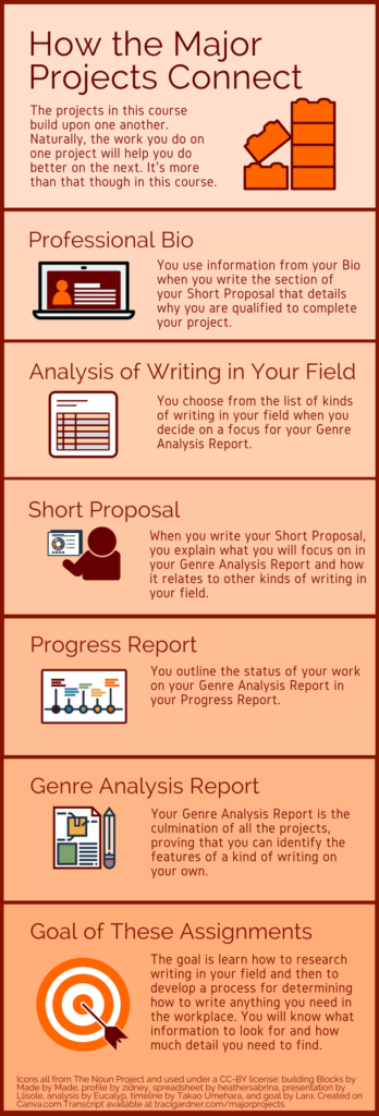
In this activity, you will focus on the kinds of writing in your field, which you should already have gathered in your Analysis project draft. Copy the list below and paste it into your comment. Add your answers for the items. After you post your answers, read what others have posted and reply, if you like. Note there’s no right or wrong answer here. You’re just sharing your opinion, based on the evidence you have so far.

  1. Your intended career field
  2. Longest kind of document someone in your field writes
  3. Shortest kind of document someone in your field writes
  4. Most frequent kind of document someone in your field writes
  5. Most important kind of document someone in your field writes (and why)
  6. Most difficult/challenging kind of writing in your field (and why)
  7. Easiest kind of writing in your field (and why)
  8. Biggest surprise about writing in your field
  9. Favorite thing about writing in your field
  10. Hokiest thing you have done (that you can talk about in class)

One final note: The remaining major projects focus on kinds of writing in your field, so this activity should help you decide which kind(s) of writing to work on for the rest of the course.


Photo credit: Stack of papers by Phillip Wong on Flickr, used under a CC-BY 2.0 license.


#TuesdayTutorial: Avoid Centered Text

#TuesdayTutorial: Avoid Centered Text published on 16 Comments on #TuesdayTutorial: Avoid Centered Text

Zig Zag Reading Pattern Caused by Centered Text
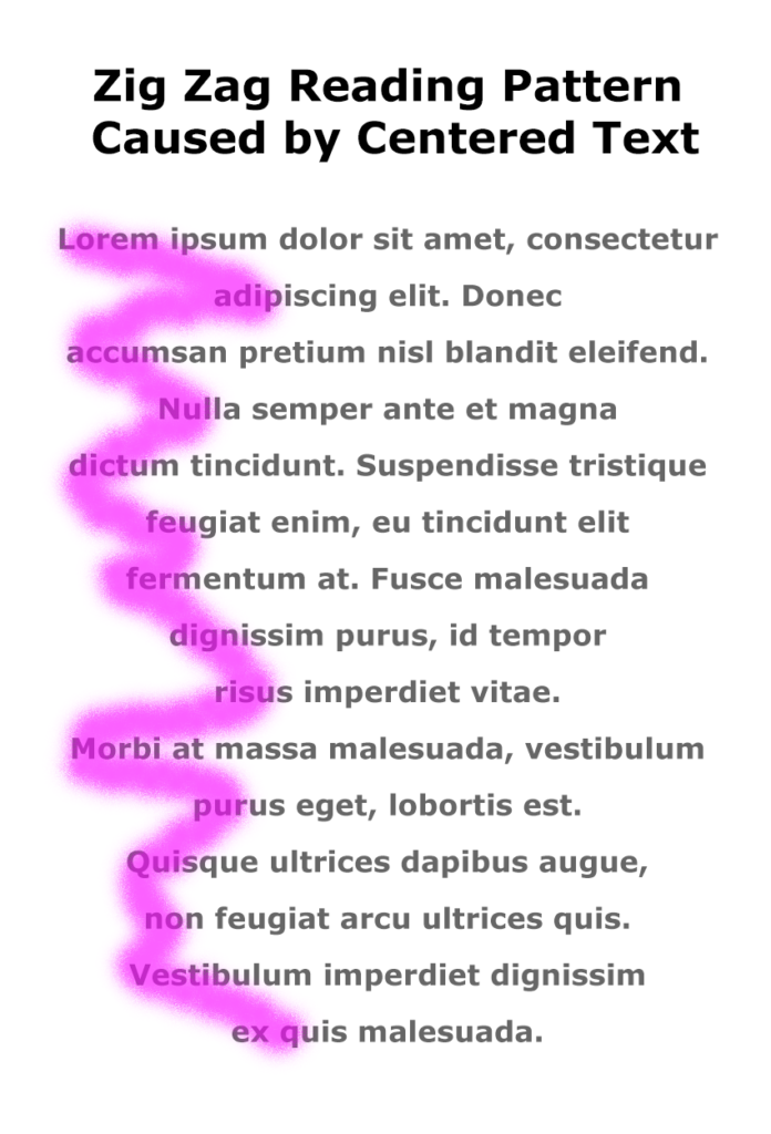
Today’s #TuesdayTutorial focuses on the alignment of the text in your document. Remember the #FridayFact earlier this month that explained the F-shaped reading pattern? That idea comes into play with the tip to avoid centered text alignment in your documents.

When you center text, the left margin zig zags back and forth down the page, which makes it hard to read in the F-shaped pattern that people prefer.

Instead of skimming down the left margin to look for the highlights and headings, the eye has to search back and forth for the information on the page, as shown in the image on the right.

Learn More

Watch the following Lynda.com tutorial video, Favor flush-left, ragged-right body text (4m14s), for additional explanations and tips on this important guideline for the way that text is aligned on a page. Remember that Lynda.com videos are free to Virginia Tech students with your VT.EDU login. Start at the VT.EDU login page to access these resources.

Note: This video has closed captioning, so it does not need a transcript.


Peer Review & Submission of Analysis Project

Peer Review & Submission of Analysis Project published on

This is the post for the week of February 19, 2018.

Screenshot from the Peer Review:Commenting Strategies video
Screenshot showing strategies from the Peer Review:Commenting Strategies video

Notes for the Week

  • Apologies in the delay in grading. I was at a conference last week, and I didn’t get as much done as I had anticipated. I hope to catch up on things soon. In the meantime, if you have a question, email me or send a message in Canvas.
  • We will do things a little different next week, since it’s the week before Spring Break. I will publish all of the week’s posts on Monday, and I will add a Module in Canvas to organize the work. This Module strategy worked relatively well during the Winter session, so we will experiment with it and see how it works for us.

Readings for the Week

Tasks for the Week

  1. By 11:59PM on Monday, February 19, submit your 02/16 Labor Log in Canvas, if you are using the grace period.
  2. Review previous posts that can help you improve your Analysis project:
  3. Rewatch the Peer Review: Commenting Strategies video for specific ways to comment on one another’s drafts. I will check for references to these strategies in your group comments.
  4. By 11:59PM on Wednesday, February 21, post a draft of your project in the Group Feedback on Analysis of Writing Projects Discussion in Canvas.
  5. By 11:59PM on Friday, February 23, post feedback on the drafts posted by your group members in the Group Feedback Discussion in Canvas. Be sure to use the strategies from the Peer Review: Commenting Strategies video.
  6. By 11:59PM on Monday, February 26, submit your project in the Analysis assignment in Canvas. If you are using the grace period, submit your project by 11:59PM on March 1.
  7. By 11:59PM on Friday, February 23, write your 02/23 Labor Log in Canvas. Specific questions for your log are included in Canvas. The grace period for your log entry ends at 11:59 PM on Monday, February 26.


#SundayShare: Why Are There Multiple Sites?

#SundayShare: Why Are There Multiple Sites? published on

You may wonder why we have more than one website for the course. In SPOT survey responses from last year, students said that there were times when they weren’t sure which website to use. One student commented, “This class was so confusing. There was so many different websites with content we had to keep up with on it.”

I certainly don’t want any of you to be confused, so I want to explain a bit more about the course sites with these FAQs.

What are the websites for the course?

We have three websites that are important to this course:

  • The Canvas site: You will turn in all your graded assignments on the Canvas site. You can also find links every day in the Announcements.
  • The Course Website (this site): the location for all course materials, daily readings, weekly work, policies, and other documents.
  • The Assignments Website: the location of the assignments for all major assignments.

If you are working toward a grade higher than a B, you may also be visiting a third site: our group on Facebook.

Why are there so many different sites?

The three main sites are intended to work together

  1. Protect Your Privacy: The Canvas site has all of the university-approved FERPA (Family Educational Rights and Privacy Act of 1974 [U.S. Public Law 93-579]) protections in place that make sure your grades and related feedback are secure. It’s federal law that I make sure your information remains private, so the Canvas site is a must.
  2. Ensure Free, Open Resources: Textbooks cost a lot of money, which is why I am committed to using free materials as much as possible in this course. Virginia Tech can claim ownership of content that is posted in Canvas (according to IT anyway). I use my own websites so that I control the intellectual property rights for everything I write. If it’s mine, I can make sure it’s free.
  3. Save Time: Lots of course resources change a little bit from term to term, but there are some that essentially stay the same. In particular I noticed that the writing assignments for the major projects were not changing from one term to the next. I added the Assignments Website to save time, which I can then use to respond to your questions and take care of other thing for the course.

Why the separate Facebook Group?

The group page on Facebook is a little different main sites. I find the Discussions tool in Canvas awkward. It’s hard to see related comments easily, and everything is in one gigantic forum.

I have tried Slack, which I personally like. Students, however, haven’t responded as well. They find it hard to follow the ideas, which are not always visually separate. The long, scrolling text can be overwhelming. It doesn’t make sense to add one more thing for you to learn when it doesn’t work for everyone, so I stopped using Slack.

I also tried Piazza, which I know many engineering students are familiar with. I love that Piazza was designed by a woman engineer to help women do better communicating in their courses. The problem was that I never figured out how to manage the flow of ideas properly. I never felt sure that I was reading and responding to everything I should. I hated feeling that I might be missing someone’s question, so I gave up on Piazza.

I ended up choosing Facebook (for now anyway). It collects all the related comments together visually. It’s easy to tell one idea from the next. I know that Facebook is an “old person’s tool”; but students usually have a login and they know how it works. There’s nothing to learn, and it does everything we need it to.

How is the main course website set up?

The main course site seems logical to me of course. I made it, so I know where everything is. But that doesn’t mean it seems logical to you, so here’s what to find under each of the menus on the site:

The Home Page
All of the daily posts for the course in reverse chronological order (the most recent posts are at the top). This is where to look for details on what to read and what to do each week. Additionally, find the daily posts that give you additional information about the assignments and other topics in the course.
Syllabus
Official information on the course set up and policies (just like the syllabus in a face-to-face classroom). This additional course information is located under this pull-down menu on every page of the site.

Accessibility Information
Details on special accommodations for the course, including information on how to get more help.
Schedule of Due Dates
A list of the work that is due in the course. This menu item is a link to the page in Canvas that is always up to date.
Course Logistics
Explanation of how to find the work you need to do each week, how the daily discussion posts work, and how to keep up with the website.
Succeeding in an Online Course
Tips on what you can do to make sure you do your best work in this course. This menu item is a link to a permanent page with an infographic.
When Your Grades Are Based on Labor
Description of how you can benefit from the labor-based grading system in this course. This menu item is a link to a permanent page with an infographic.
Requirements
Explanation of the course assessment system, and a complete outline of work necessary in the course, including details on how to earn a grade higher than a B.

Labor Log
Description of the weekly journal requirements for the course, which contribute to the final exam in the course.
Writing Groups
Information on the online writing groups that are part of the peer feedback system in the course.
Major Projects
Brief description of the five major projects that are required in the course, with links to additional information.
Final Exam
Step-by-step instructions on how to complete the final exam assignment for the course.
Course Help
Links to information on the site that can help you do well. This page includes links only.

Campus Resources
Outline of places on campus where you can get more help for the course (like the Writing Center).
Ten Ways to Improve Your Writing
List of ten common strategies that will help you do better in the course.
By Title
Links to all the daily posts on the site, listed in reverse chronological order (the most recent posts are at the top).
By Category
Links to the daily posts on the site, sorted by the categories they were published in (e.g., #TuesdayTutorial).
Sitemap
Links to all of the pages on the site, in alphabetical order.
Contact Info
Form for visitors to the site to use if they want to send me a message. Students should email me directly or send a message in Canvas.


#WeekendWatch: Accessibility in Word

#WeekendWatch: Accessibility in Word published on 7 Comments on #WeekendWatch: Accessibility in Word

Lynda.com Login Help

Lynda.com videos are free to Virginia Tech students with your VT.EDU login. Start at the VT.EDU login page to access these resources.

Our #WeekendWatch shares one more way that you can improve your table for the Analysis project: Spend some time making your table accessible to people who use magnification or screen readers.

Here’s an example of why accessibility matters in a table. If a table is not set up properly, the screen reader will read the information as if the columns follow one another like sentences in a paragraph. The reader moves through the document from left to right and top to bottom. To make a table more accessible, you need to identify table headers. Once you do, the screen reader will read the column header and then the content of the cell.

The Lynda.com video below demonstrates how the process of Using the Accessibility Checker, which is built into Microsoft Word. The simple tool will suggest ways that you can change your document to make it more accessible.

Screenshot of Lynda.com lesson on checking accessibility in Microsoft Word

You can learn more about accessibility in Word by watching all of Chapter 2: Creating Accessible Word Documents on Lynda.com. In addition to the Lynda.com videos, you can find more information in the resources linked below:


Note: This video has closed captioning, so it does not need a transcript.


#FridayFact: Tables Can Be Boring

#FridayFact: Tables Can Be Boring published on 17 Comments on #FridayFact: Tables Can Be Boring

Old French Table by French Finds on Flickr, used under a CC-BY license
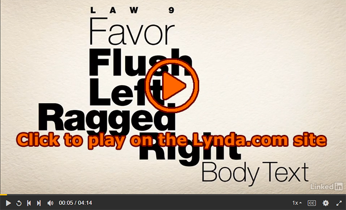
This week, I have been sharing information to help you polish the content and design of your Analysis project. Today, I am continuing that theme with my #FridayFact: Tables can be boring. If you do not work on document design, tables are often a visual jumble of words and numbers. Same goes for spreadsheets, but we won’t talk about them in this course.

Back to tables, with so much information jammed into columns and rows, the information can become hard to read. If it’s hard to differentiate between the rows of information, readers can easily lose track of where they are in a table. When the column headings scroll out of view, readers may not recall the information every column contains.

To help you solve the challenge of boring tables, I have these articles you can read and apply to your Analysis project:

There are a lot of ads on these pages. I use a browser extension that hides all the ads. I never see them at all. If the ads bother you, you might try one of the blockers too. I’m using Adblock in the Chrome browser.


Photo credit: Old French Table by French Finds on Flickr, used under a CC-BY license.


#InfographicInspiration: Choosing Colors

#InfographicInspiration: Choosing Colors published on 38 Comments on #InfographicInspiration: Choosing Colors

Using a Color Picker

Color Cop Icon
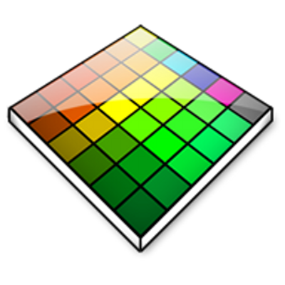
Often you see images on a website or photo that you like, but you may not know how to get the exact RGB or Hex codes to use them. You can use a color picker app to identify colors on your screen.

I use Color Cop on Windows and the Coolors Generator in my browser. You can find other options (free and paid) for Mac and Windows by googling for "color picker."

Today’s #InfographicInspiration focuses on colors. When working with tables, you can use shading and borders as part of your document design. Chosen well, colors can greatly improve a project, making the information more readable by creating contrast and highlighting important details. Chosen poorly however, colors can make a project harder to read because they lack contrast or distract from the information.

Think about how you use a highlighter in your notes or a printed book. If you highlight an entire page, essentially nothing is highlighted. Nothing can stand out. You have to have contrast between highlighted words and the rest of the page. Likewise, if your highlighter is drying out, it can leave very faint marks on the page. Again, there isn’t enough contrast between the elements on the page.

To make the most of your color choices, consider the ideas in today’s infographic. Any one of the ways of linking colors can make a nice contrast (e.g., choosing complementary or triadic colors). At the bottom of the infographic, you’ll find color palettes of combinations that work well. Do note that the infographic is British, so it uses British spelling.

How to Choose Colours That Work Well Together

Transcript for this image is available.


#WednesdayWrite: Can You Be Creative?

#WednesdayWrite: Can You Be Creative? published on 22 Comments on #WednesdayWrite: Can You Be Creative?

Lego Man Sugar Cookies by Betsy Weber on Flickr, used under a CC-BY 2.0 license
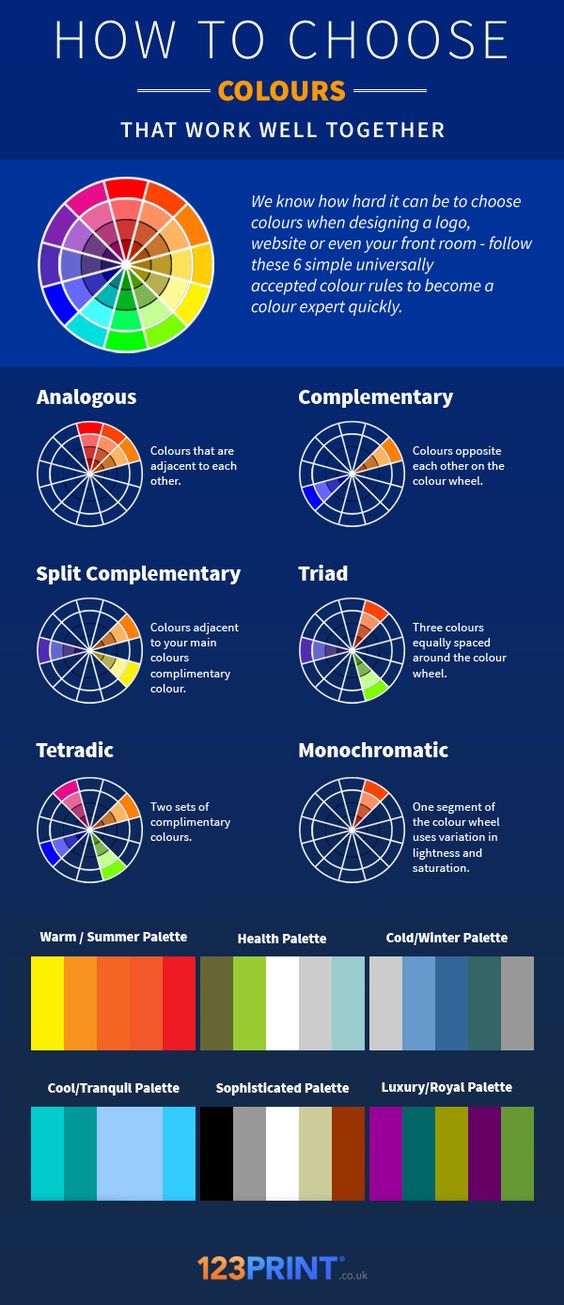
One of the limitations of sharing examples of a project with classes is that everyone then turns in nearly identical projects. Students take the examples as the only way to do the project, so they complete their work so that it looks precisely the same.

It’s like cookie cutter projects. The icing may be slightly different, but it’s obvious they are all part of the same batch. In fact, if you didn’t know better, you’d think they were plagiarized.

So today’s #WednesdayWrite is a challenge to you: Can you be creative? I hope so because your job this week is to brainstorm some ideas to get everyone thinking creatively.

Review the student examples from the assignment:

Once you have a good idea of the information and design used in the examples, spend some time thinking about the ways the examples are very similar.

Next, it’s time to get creative. Add a comment (or reply to a comment here) with idea(s) on what could be done differently with the Analysis project to make it stand out as different and more creative. To help you think about the possibilities, consider these questions:

  • Can you add details that are not part of the required information?
  • Is there a column you can add that is unique?
  • Can you think about the kinds of writing in a different way?
  • What can you do with document design that will make your work stand out?
  • Can you include something relevant in addition to your table of information?
  • What can you do to “think outside the box”?

I will point everyone in the class to this post next week, and encourage them to find some ways to make their projects different from those examples.


Photo credit: Lego Man Sugar Cookies by Betsy Weber on Flickr, used under a CC-BY 2.0 license


#TuesdayTutorial: Improving A Table’s Appearance

#TuesdayTutorial: Improving A Table’s Appearance published on 21 Comments on #TuesdayTutorial: Improving A Table’s Appearance

Lynda.com Login Help

Lynda.com videos are free to Virginia Tech students with your VT.EDU login. Start at the VT.EDU login page to access these resources.

Document design matters in every project you will compose in the workplace. If you think back to the CRAP infographic, you know that your choices can influence a reader to examine your document fully or to skip it altogether. Bad document design often leads folks to declare, “tl;dr” (or “too long; didn’t read”).

Most of the daily posts this week will suggest ways that you can improve your Analysis project by paying attention to the layout and formatting for your table. For our #TuesdayTutorial, I’m sharing some Lynda.com videos that demonstrate basic options for Formatting Table Appearance for Word 2016 and Word 365. If you have another version of Word, you should notice similar options in your version.

To learn even more about how to design your table, watch the entire chapter on Tables for either version or skip around and choose the sections you need:


Note: These video have transcripts, so they do not need transcripts.


Working on Your Analysis Project

Working on Your Analysis Project published on

This is the post for the week of February 12, 2018.

This week, you will continue working on the Analysis of Writing in Your Field Assignment project. I have some activities that will help you find more information you can add to your project.

How the Major Projects Connect
Transcript and larger image available

Readings for the Week

Tasks for the Week

  1. By 11:59PM on Monday, February 12, submit your 02/09 Labor Log in Canvas, if you are using the grace period.
  2. Remember that you can ask any questions you have about the Analysis project in the Analysis of Writing in your Field Questions.  If you have any questions, check there first to see if they have already been answered. If they have not, post your question there, and I will answer when I check in.
  3. Consider the general categories of communication that occur in your field. Read the information on the Poster: Writing and Communication – WOVEN from Georgia Tech, and then add your replies to the WOVEN in Your Field Discussion in Canvas. Post your response by 11:59PM on Friday, February 16. The grace period for your response ends at 11:59 PM on Monday, February 19.
  4. Review the Readings for the Week for information that relates to your field. As you find relevant information add it to your Analysis table.
  5. Continue work on your Analysis project. Here are the relevant dates for the project:
    1. Wednesday, February 21 by 11:59PM: Post a draft of your project in the Group Feedback on Analysis of Writing Projects Discussion in Canvas.
    2. Friday, February 23 by 11:59PM: Post feedback on the drafts posted by your group members in the Group Feedback Discussion in Canvas.
    3. Monday, February 26 by 11:59PM: Submit your project in the Analysis assignment in Canvas.
    4. Thursday, March 1 by 11:59PM: Submit your project in the Analysis assignment in Canvas, if you are using the grace period.
  6. By 11:59PM on Friday, February 16, write your 02/16 Labor Log in Canvas. Specific questions for your log are included in Canvas. The grace period for your log entry ends at 11:59 PM on Monday, February 19.


Primary Sidebar