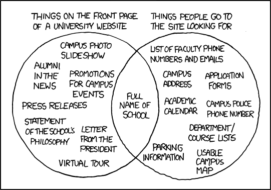
Many of you have probably already seen the XKCD comic below, titled “University Website.” Beyond being a funny reflection on what you see on college websites, it’s a great example of what goes wrong when composers fail to think about what their audience needs. The people who decide what goes on these websites are meeting someone’s goals, but not all of the people who go to the site for information. I haven’t compared all the items in the comic to the Virginia Tech website, but I suspect that a lot of the details are quite true.
Permanent link to this comic: https://xkcd.com/773/; Long Desription below.
You can participate today in two ways: adding a comment that analyzes a university webpage, OR replying to someone else’s comment and explaining why you agree (or disagree) with their analysis. The details on the two options are below:
Option 1. Add a Comment Analyzing a Webpage
Our activity this week is to complete a similar analysis of another webpage. Find a page on the Virginia Tech website, and compare what shows on that page to what you would look for when you go to that page. I have some guidelines for you:
- Choose a page that is in the vt.edu domain. You can look at a page for your major, a course, resources you use on campus, and so forth.
- OR choose a page that is clearly related to Virginia Tech, such as a page for a club, Greek organization, and so forth. If you’re not sure, send me the link and ask me.
- You may NOT use any page that I have written or that is about me. That just gets weird and awkward.
Once you choose a page, do this:
- Tell us the name of the page (for instance, English Dept homepage).
- Share the link in your comment.
- Talk about what you see there.
- Talk about what you think people would go there for.
- Draw some conclusions about how well the page meets the needs of its audience.
Finally, you are just making a comment. You’re not trying to write a formal comparison-contrast essay. Use short lists or fragments, whatever will make sense to people who read your comment.
Option 2. Reply and Discuss Someone Else’s Analysis
You can reply to a comment someone else has made (or even several people if you want). Your goal would be to think about whether you agree with that commenter’s analysis and explain the reasons for your response.
Comic Description
By XKCD
A venn diagram. The left circle is labeled "things on the front page of a university website" and contains "campus photo slideshow," "alumni in the news," "promotions for campus events," "press releases," "statement of the school's philosophy," "letter from the president," and "virtual tour."
The right circle is labeled "things people go to the site looking for" and contains "list of faculty phone numbers and emails," "campus address," "application forms," "academic calendar," "campus police phone number," "department course lists," "parking information," and "usable campus map."
The only item in the overlapping section is "full name of school."
Title text: People go to the website because they can't wait for the next alumni magazine, right? What do you mean, you want a campus map? One of our students made one as a CS class project back in '01! You can click to zoom and everything!
32 Comments
A page I often visit is the ECE Department’s page on the curriculum required for undergraduate students (https://ece.vt.edu/undergrad/curriculum). Myself and lots of others visit this page to see when it is recommended that we take certain classes and links to descriptions of the classes, as well as the classes we can take for technical electives. Overall I think that the page is well designed and shows most of the information that I’d look for. But one thing I often find missing is that there is no link to show which courses can count as design technical electives. When planning out electives, having a link like this wold be very helpful because we wouldn’t have to click through every class description to see if it counts as a design technical elective.
I agree with you. I visit the ECE Department’s page very often as well. Most of the time, I go to look up professors or to see what courses I should be taking in the upcoming semester. The professor bios and class descriptions are extremely helpful when determining which courses I should take. I will say that I have always found it easy to figure out what courses are design technical electives. Other than that, I completely agree with you and think that the site is well-designed compared to other departments at Virginia Tech.
I agree with you. The ECE Department’s page is well designed and easy to use. It includes every information I need on every page in my opinion. You said that there is no link provided to show which classes count as DTE, but if you go to the link to the TE and expand the ECE elective list, the list will show you all classes including DTE and TE classes. The DTE classes are marked as “DTE” next to the course name.
I agree for the most part that the ECE site is good, as far as the information contained on it is concerned, but it isn’t designed particularly well for navigating back and forth. If you click on a course to open it in the same tab and then go back to the previous page, you have to enter the degree program and year again. Other than that, it is very useful compared to the plain checksheets in that you can view descriptions on the classes you’ll be taking.
I went on the Scholarship Homepage for the College of Agriculture and Life Sciences at Virginia Tech to look for scholarships under the link: https://www.cals.vt.edu/index.html. On this website I see a picture of someone who had won a scholarship, On the right there are buttons for how to get involved with Alumni, the new faculty, and any relevant events that are happening. On the main part of the page it has “A Look Back at Virginia Tech’ as well as “Top News”. People would go to this website to look for a scholarship and not to check out the “Top News” of the College of Agriculture and Life Sciences. I don’t think this page meets the needs of the audience. The audience are students who are looking for relevant scholarships that they can apply to for the academic school year. However, there is no link on the website for applying to scholarships which is the main reason for being on the page. On the top are drop-down bars that apply to academics, departments, and faculty, however under academics there is no button for scholarships.
I think this applies to the comic because a lot of times people who go on these websites are students who need concrete information such as: phone numbers, emails of faculty, and a link to sign up for scholarships. However, what they receive are pictures of new faculty members, success stories of people who applied to scholarships, event calendars and generic information about the College of Agriculture and Life Sciences. My only problem is that since this is the general info page of CALS they should have a space where it’s easy to see where to apply for scholarships. I specifically typed in “CALS scholarships” so I assumed I would be brought to a home page that would allow me to sign up for scholarships, but I was brought to the homepage that didn’t give me much information. They missed the point of the website and it will probably take clicking a couple more links to get to the correct webpage where people can actually apply to scholarships, so I think it could be way more efficient with having a direct link to apply.
I don’t think looking for scholarships is a primary use-case of the CALS home page, so I disagree that it’s a problem that scholarship information isn’t directly linked by it. I would expect a department homepage at our university to showcase research in that department, since the main goal of departments here is probably to attract graduate and postgraduate students and persuade people to make donations and grants.
Scholarships are accessible via the “Money Matters” links on the “Accepted Students”, “Current Students”, and “Future Students” pages, which are accessible under the Academics menu. I think this is a reasonable place to put it, since scholarships are most relevant to current and prospective students. I don’t think “Money Matters” is a particularly informative title though, since it took me a few seconds to find it when I was intentionally looking for it.
The page I chose to analyze is the CS Department’s page on the graduation requirements for undergraduate students found here: http://www.cs.vt.edu/undergraduate/checksheets
Like the ECE department page that Katie analyzed, students visit this page to see the checksheets for their graduation year. These checksheets show the recommended coursework for each semester. This page has clear links to each graduation year checksheet, however, these links are just to PDF scans of paper checksheets. These PDFs do not contain any links to course descriptions or CLEs, so the page is not very helpful/convenient for its audience because they have to navigate to and from multiple pages to get the information they want. I also just thought that the cs.vt.edu page as a whole is outdated compared to the ECE department page.
Katya, I completely agree with you. I am apart of the ece department and did not realized how updated the department page is. Even though, ece.vt.edu has a many links to direct you to either the undergraduate requirements, it still emphasizes promotions for campus events; as mentioned in the venn diagram, this is a negative aspect to the page. When I visit my major website, I am in need of curriculum and not everything else. However, compared to cs.vt.edu, the ece page is definitely a step ahead and proves the cs page needs a little work.
I completely agree with you on this matter! Since I’m a statistics major, the checksheets have been changing every year since 2016 so every time I run a DARS report on hokiespa, it says that I haven’t met the necessary requirements to graduate although my advisor said otherwise. That being said, the link for checksheets should be more interactive in a way where you could fill in your classes digitally and not by printing and handwriting it. I’m sure that Virginia Tech will act on these challenges and obstacles in order to create a better relationship with their students, faculty and anyone trying to get a grasp of their services. I see all these problems solved on the long run though.
Omar, I completely agree with you. The statistics page has changed every year since freshman year. At the beginning of this semester I got an email from the Registrars office saying that I was not in line to graduate this May. This is because the required check sheets keep changing. But I emailed my advisor about it and she said that she has to change it manually. Even though everything is fine, it gave me a near heart-attack when I got an email saying I could not graduate.
I absolutely agree about the CS Department’s resources for their degree checksheets. For students going there to find their degree requirements, it’s not even available until 1 or 2 years up to graduation, and when it is, it’s a poor scan of a PDF. It’s a pitiful system for a department that’s specifically supposed to excel in technology, and it does a huge injustice to the curriculum and the students studying it. The presentation of their information could use some work too. It takes hours and hours to interpret everything on the checksheet.
I at least appreciate that the College of Engineering tries to make their department degree checksheets similar, although that should be a university effort. It’s a mess trying to coordinate the requirements for anything more than a single major.
(Note that EE and CS look alike, as do the others in the CoE.)
I love the idea that the major checksheet should be interactive. It’s true, every time I pull up the checksheet, I also pull up the timetable to research the classes I need. This is an unwieldy that I’m sure I have done over 1000 times. Perhaps the DARS report could show a visualization of the path towards graduation. Classes that have been completed could be highlighted and selecting individual classes could provide additional information pertaining to that class.
The Food Science and Technology Department homepage (https://www.fst.vt.edu/)
The first image you seen when you visit the site is a typical picture of a student in a lab setting titled “Graduate Research” and it rotates with an image of students visiting a industrial lab titled “Brewhouse”. As you scroll down, the next items you see are the title of the department and its mission statement. On the right side of the screen, there is a column dedicating to contact information, including address, phone number, email, and social media. After the mission statement, there are three columns with links to various resources, each titled Academics, Research, and Extension, respectively. Finally, at the bottom of the page there is a News & Events with links.
As a student, I am generally looking for contact info for my professors or advisers. If I clicked through a couple links from the homepage, I am able to find it but it isn’t obvious. I also look for scholarship opportunities and do not see any info on that.
All in all, it is not a bad homepage. It has been designed recently which makes it a little bit more clearer and easier to maneuver through. The news & events section is definitely just meant as a promotional tool and not for current students but otherwise very accessible for students.
I do like their recently upgraded page–it’s a great improvement.
About scholarships, I am easily able to find descriptions of the various FST scholarships available, but I can’t find anywhere to apply for them or information regarding deadlines. Finding the faculty wasn’t difficult, but I definitely think that Linda Granata’s information should be much more accessible, seeing as how she is the head of the department.
Another gripe I have with this website is finding information regarding the FST minor. If I look at undergraduate information and those options, no where does it even mention that a minor is offered. As someone who is pursuing that path, having information and links to resources (like checksheets) would be very helpful.
The Chemical Engineering Department page (http://www.che.vt.edu/) fits the message of the comic well. When you open it, you get a news reel of all the recognition the department and it’s faculty are getting from the school and the news. On the right, there are big buttons including “Faculty Openings”, “Give to ChE”, and “Alumni: Tell use about yourselves”. The outline I would expect for such a page would include big sections for undergraduate and graduate students (since they are the largest audience) that include clear links for class checksheets, forms, etc. which are the most important information to students in the department. Unfortunately, these links are reduced to side text that lay in a big pile for the user to seek out. It takes me 2 total clicks (summed AFTER I figured out where everything was) to get to the major checksheet – a document from the department that I would consider the most important for an undergraduate student. This epitomizes the website since most of the other things I would consider valuable are also a few clicks away.
I am a chemical engineer, and I completely agree with your statement about how hard it is to find the check-sheets, and information for undergraduate students. Yes, it is nice to know what our faculty are doing, and the accomplishments they have done, but the developers of the website make it seem like alumni are the target audience. It seems to focus on chemical engineers who have already graduated to give back to the department, which can be frustrating for the number of undergraduate students, and even general engineering students who are thinking about studying chemical engineering. However, it does also seem like the page has not been updated in a while, considering it still has the old Virginia Tech logo, and the “invent the future” slogan, which is no longer part of our name.
My guess is that the developed the website, and the only thing they really update is the actual check-sheets, which directs you to a different website all together, and what the current faculty is doing. Then again, it is a bunch of chemical engineers, not computer scientists or web developers.
I could not agree more. I am a mechanical engineer and often I look to check the degree path sheet to ensure all the correct classes are requested. When going to the Mechanical Engineering Department website, I often scroll down looking for the necessary links and just find info mostly about different projects going on. I have no problem with the website showing that but I would prefer to have a highlighted shortcut which is easy to find for undergraduate necessities like degree path sheets, faculty contacts, etc. It’s a difficult task to make both potential students and current students happy but I think there is room to grow with our websites.
I completely agree with you Benjamin. My major is Mechanical Engineering so I often am on the ME department’s website looking for tech elective lists and degree path sheets. Usually I get so frustrated looking for what I need I end up just googling “Virginia Tech ME Tech Elective List” or “Virginia Tech ME Degree Path Sheet” as I know it will give me the answer infinitesimaly faster than trying to navigate the ME department page. I find it ironic that they put so much emphasis on tooting their own horn on how many projects they have an how you can be the next Elon Musk yet to find out how to actually take part on the teams you have to give up your left arm to find the link. I think the purpose of the websites should be to help students and show-boat how great the department is (Its greatness can be highly debatable amount ME majors).
As a ChemE student, I definitely agree with your comments and I do think the department needs to do some adjustments to this webpage if they really want to have a useful website for us ChemE students. There are many important things that can be highlighted in the main page such as the information of our adviser as that is the person we students would always refer to if we are experiencing any academic problems. So instead of putting out articles and stuff why not putting a little section above about the adviser’s contact information which is easy for us students to find instead of having to search for it. The menu options also needed to be more organized though as it is quite confusing for me sometimes when scrolling through it to find specific information.
I looked at the Civil and Environmental Engineering home page (http://www.cee.vt.edu).
When I first look at the page, there is a slideshow that has photos of different students who won various awards. Above the slideshow there is a drop down with various categories that can take one to different links related to Civil and Environmental Engineering. Underneath the slideshow there are photos (that have links) to the various branches of Civil Engineering. These links are: Construction Engineering and Management, Environmental and Water Resources Engineering, Geotechnical Engineering, Structural Engineering and Materials, and Transportation Infrastructures and Systems Engineering. Underneath that there are new articles about various things related to Civil Engineering.
I think that people will go to this page mainly to see what the major is about and what the different branches are about. That way people will know if something about this engineering major interests them. Also, people will go here that are current Civil students and they are trying to find the requirements (check sheet) that there are to graduate. Another reason Civil students will go to this website is to find out contact information for various teachers that they have in the department.
I feel like this website is not very efficient when it comes to the main use that students use this webpage for. Many want to find out the graduation requirements, and there is nothing straightforward on the page of how to get there. Instead, you have to take many different links from the dropdown in order to eventually get there. I feel like some of the information that is on the homepage isn’t as useful to students as other things. News articles aren’t that important to students, however quick access to graduation requirements are more useful.
I definitely agree with what you stated about the Civil and Environmental Engineering site. It definitely showcases the successes of the programs students and provides an overview of the various fields in the college. For someone interested in CEE, they can find a wealth of information on the pages. Your comment about finding graduate requirements is quite valid. Whenever I need to find a checksheet, I resort to google because it is so much faster. The flaw of this website would be not making these requirements easily accessible to the students who need it. Making a drop down for graduate requirements could easily solve this problem. However, I do disagree about the news articles. I find them important because it captures current events in our field and how we are active in serving society. This can be quite beneficial to someone learning about the profession and for those in the program, can apply it to some of their classes.
I totally agree with Danielle’s comments on the Civil Engineering website. The website highlights honored people within the the department, and provide links about the the different disciplines under Civil Engineering which is somewhat useful. I think the website does not necessarily meet the needs of the users because people do not visit it to see honored individuals.
The most significant information I visit the website for is the department’s check sheet which is not so easy get from there. I am sure students visit the website for that as well. Another information is the dates for important upcoming department events such as ASCE meetings. Those information should be the first thing on the website because most people visit it for that. One has to use the search engine, and dig through lots of links to locate events, and that is not a good idea.
The webpage I chose to look at was the Dean of Students’ web page in the Student Affairs department (https://www.dos.vt.edu/). The first thing you notice about the page is a picture of a couple of students gathered around a laptop (all smiling, of course!). This is literally the only thing you can notice as this picture took up my entire laptop screen. Upon scrolling down you are presented with a list of administrative tasks the Dean can help with. Among these are the main reason I believe people would come to this page – Class Absence Verification and Personal/Academic Support. While these are the only reason I believe people would visit the site, the webpage also includes information on the Dean of Student’s “Mission Statement.”
One major flaw of this webpage is the lack of corresponding links to or information about how to contact the Dean for specific issues. Yes, the webpage tells you what they can assist you with, but it does not direct you to where you can request assistance. In order to find this information you have to do a little bit of digging around through the links at the very bottom of the page. The one thing the webpage does provide a very clear link to is the “report a bias related incident” survey. Since this is not something I came specifically to the webpage for, I am unsure how often this is actually used. In conclusion, This webpage contains all of the information I expected to find on it, but very few ways to accomplish the tasks laid out in the webpage itself. Thus, this webpage could easily be improved by including links or contact information next to the specific task the Dean of Students could help with.
I completely agree with the major flaw you pointed out. Direct links are difficult to find and usually lead to several more options, all of which are confusingly labeled. From experience, when I was first looking for information about colleges, most websites listed the highlights of research and media coverage instead of how to apply and what to expect at the given university. In some cases, I even had to create a guest account before having access to helpful information about applying, financial situations, and deadlines.
Personally, I think the front cover pictures of students laughing and smiling around a computer are somewhat ironic and should be replaced with pictures of students playing sports and laughing or reading a book/computer with a “study face” on.
I think you’re completely right about this site probably being accessed primarily by students in crisis for class absence verification and personal/academic support, and that merely listing things they can help with is far less helpful when the process to actually get that help is unclear. The site should make it very clear what steps need to be taken in order to get that support, and make the process as easy as possible.
A web form that guides you through all the information required to get access to support would be an ideal way to meet the needs of this audience. It could ask some of the more boilerplate questions and compose an email or set up an appointment on behalf of the student. It would lower the barrier to getting help a lot.
The university website I visited was the home page for Civil and Environmental Engineering (http://www.cee.vt.edu/).
The webpage has a slideshow displaying the achievements of members and alumni of the Civil Department. Further down the page it has links to articles about department highlights and news. It also has links to the homepages of the various branches in Civil Engineering.
I think that people visit the webpage to learn more about the Civil Department and the different branches in Civil Engineering. The webpage would provide information for prospective high school students as well as current Virginia Tech students trying to decide on their major. People would also visit the site to find information on civil advisors, descriptions of civil courses, and civil checksheets for graduation.
I think that the webpage does provide all the information that people would go there looking for. However it showcases news and articles on department achievements instead of providing easy access to the information most people visit the site looking for. Overall, I think that it is important to acknowledge the accomplishments of the department and the webpage does provide links to a lot of relevant information so it does a good job of meeting the needs of its audience.
I totally agree with you Nathan. The Civil and Environmental Engineering web page looks appealing but searching for information can be irritating. There are always links upon links to get one piece of information. News and articles should be secondary to the departments web page to provide easy access to needed information.
The university website that I visited was the Myers-Lawson School of Construction website (http://www.mlsoc.vt.edu). Upon review of the information on the front page I realized that the comic’s Venn diagram almost directly reflects the information found here. There is a slideshow that contains links to articles about recent alumni, expansion of the school’s facilities, and discussion of industry ideologies that are studied in the curriculum. Along with this slideshow there is a list of upcoming events, a list of news and from around the school, and of course a link for donations to the program.
One of the more frustrating features about this website is the fact that there is no clear link to a page for prospective and current students. In order to get to the page with this information I had to go through several links and pages with the hope that I would end up at a page with this information.
Ultimately, as long as the right links are clicked on the right pages, you can find any information that you might need as a current or prospective student. I definitely believe that this page could be better built to make information easier to find.
The emphasis on the school’s initiatives is present heavily on their main page. I agree with Kimberly, the headers and titles are labeled “Our Programs,” “Our People,” “Our Community,” etc. which don’t hold much information about deadlines, forms, or directions on how to get to the school. They have several portals to donate on the main page and on subsequent links as well. There are several articles on the school’s involvement with the expansion of Virginia Tech and with Virginia companies around the state. News and prowess seems to be the centerpiece here
Recently, i often go the home page of the VT: https://vt.edu/. because i am taking a web design course and our project is to design a website that can satisfy all the devices like desktop, mobile and tablet. the reason i often check the VT home page is after they released the new website last semester they had some really nice features.(even many people complain s about the UI design) the new design are able to handle all the device with different screen size, and it has nice tab bar for mobile devices. if you can remember that the old version of the VT home page on a mobile devices was exactly the same as the desktop site and they just made every thing smaller for suit the small screen. the new version is more user friendly, and the compose style is more readable we don’t have to zoom in for click a small button.
People can check the school announcement, academic programs and some new research etc. Overall, i think people can easily find what they need on the home page.
This is the link to VT’s Animal and Poultry Sciences Webpage: https://www.apsc.vt.edu/
A lot of prospective freshman will visit this webpage to learn about the major. If they are choosing to major in animal sciences because they “love animals,” then the webpage does a good job catering to that. It features a scrolling picture banner of cute farm animals interacting with people. A lot of current students will also visit this page and unfortunately there is no direct links to major requirements, research opportunities, job openings, etc.. Thus, for current students, the page is lacking. There is however, a big dark red “Give Now” button so obviously the department is emphasizing donations. On the bright side, the contact information is very accessible so further information should be easy to acquire. This might be a strategy for get prospective students to invest more energy and actually talk to someone in the department