 One of the limitations of sharing examples of a project with classes is that everyone then turns in nearly identical projects. Students take the examples as the only way to do the project, so they complete their work so that it looks precisely the same.
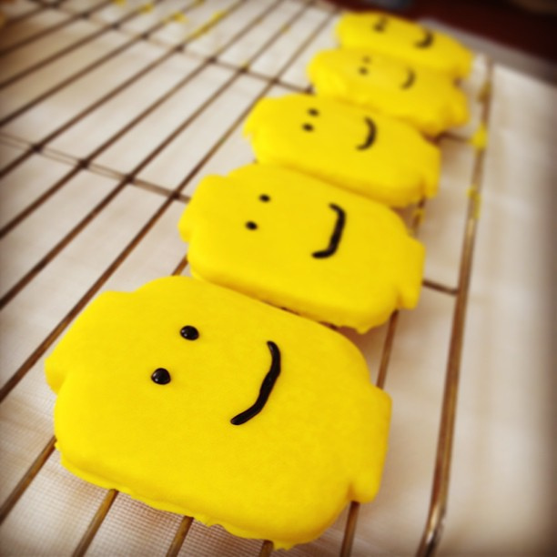
It’s like cookie cutter projects. The icing may be slightly different, but it’s obvious they are all part of the same batch. In fact, if you didn’t know better, you’d think they were plagiarized.
So today’s #WednesdayWrite is a challenge to you: Can you be creative? I hope so because your job this week is to brainstorm some ideas to get everyone thinking creatively.
Review the student examples from the assignment:
Once you have a good idea of the information and design used in the examples, spend some time thinking about the ways the examples are very similar.
Next, it’s time to get creative. Add a comment (or reply to a comment here) with idea(s) on what could be done differently with the Analysis project to make it stand out as different and more creative. To help you think about the possibilities, consider these questions:
- Can you add details that are not part of the required information?
- Is there a column you can add that is unique?
- Can you think about the kinds of writing in a different way?
- What can you do with document design that will make your work stand out?
- Can you include something relevant in addition to your table of information?
- What can you do to “think outside the box”?
I will point everyone in the class to this post next week, and encourage them to find some ways to make their projects different from those examples.
Photo credit: Lego Man Sugar Cookies by Betsy Weber on Flickr, used under a CC-BY 2.0 license
22 Comments
I thought the Android Developer’s Table stood out the most in the group. I thought the use of photos was very creative. Perhaps if you have had some experience in your field, you could mention your experience with the types of writing you have chosen. Even better, if you have had different experiences at different companies, you could compare/contrast the two. You could also organize them by formality. I think that I should be able to look at the table and, based on the styling and format, know what field it was meant for. You could also have subcategories within your types of writing. For example, email correspondence with an executive would be extremely different than it would be with a team member.
I agree Ben, I felt that the Android Developers table stood out the most. The use of color was different from just the typical alternating rows of color which made it easy to understand the different categories. I also really liked how their pictures/categories created groupings beyond just the simple types of writings. I really liked your idea of including experiences from industry in the table; that could be more beneficial than the examples you could find online.
I think adding a column about your personal experience would be a great contribution to this project. I think that will provide an interesting opportunity for reflection as well when you use this project as a resource during your career. You could even add to that column throughout your career as you learn more about that type of writing in your specific company.
Additionally, you could add a column about the preparation required for that type of writing. Looking ahead, I think preparation is a piece of information we need to include in our genre analysis reports. You get ahead on the research for the next project by including that information in your table now.
Good observation, Katya 🙂
I agree with Ben that the Android’s Developer table stood out the most out of all three examples that were given. I felt like table three had a unique color scheme where the main sections with text were just white, instead of having color everywhere like the other two examples. Plus I felt that the Android’s Developer table had a lot more columns, therefore, it provided a lot more detail about the different types of writing. I also liked that this table included some pictures, which was different than the others as well. To be creative for my table, I can create a column on the far left that has the different WOVEN fields and the types of writing that I chose, I can put them under the correct section.
I at first thought they all looked quite unique and creative, but I agree that your suggestions would heavily improve upon what’s already there. To personalize the table, adding our own experience with these forms of communication in the workplace would greatly diversify its content from others. I also like the idea of addressing formality. It’s often part of the job to represent a company or product in a formal manner rather than just communicating between coworkers or other companies contracted to your service. So, I think a formality column would be a good addition as well to distinguish the different shapes that each take.
As for style and formatting, I think they all look high quality as is. It might just be my opinion, but anything more than this seems over the top for an English assignment. These projects and assignments we’re doing are already significantly larger and much more involved than other Technical Writing sections’…
I agree with what everyone has said regarding personal experience. I think the examples are all similar because they have color, and they include the length of the document that could be found in your field of study. However, I think the Android developer had a much more in-depth paper regarding each individual component of a document. I think that to be more creative, maybe adding a section that has an image of what the document is/looks like could be helpful. Almost like seeing a template of what it would look like so that you know what to expect. The only problem with this is that it could be hard to find online templates of each document because that could be proprietary information for companies. If not the template image, some other image that indicates what type of document it is so that the project isn’t all words and it can be broken up by images.
I agree with you that the Android developer is the best example of the three. What makes it the best, even at first glance, is the background color selection. The pink, dark blue, and white colors complement each other very well and the bright pink color instantly draws the readers eyes to the titles while the white background makes it easy to read. The packaging example has colors that are too somber while the Real-Estate example has colors that simply aren’t pleasing to the eye. Content wise, I love how the android example has several more columns than the other two examples and it contains links to further information which his super helpful. The most substantial weak point of the android example in my opinion is for length of document, it lists the number of words which isn’t very helpful for me. Being given the number of pages or slides is more useful for me.
It is obvious that the Android developer’s table is more aesthetically pleasing than the other two. The packaging engineer and the real estate brokerage are almost identical. The main difference is just color scheme. The columns are identical, except for the addition of a medium type in the packaging engineer table. This is not a big enough difference between the two to be noteworthy. The Android developer did get more creative with their design, choosing bright unlikely colors and adding pictures. The content columns are similar to the other two but the presentation of the information is what truly makes it stand out.
I know the design aspect of my assignment will be the part I will struggle with the most. I do not know how to make mine stand out. The personal experience idea, while good, is not relevant if you are still in the process of gaining experience. Perhaps adding a column on importance and relevance would be appropriate. Understanding why a certain writing or communication exist would help motivate me to be comfortable with all the possible communication forms. If I don’t see an obvious importance, it can be difficult to give them the attention they need.
I agree with what everyone said about the android developer’s project was set apart because of the design of the table. I think improving the design and maybe adding an additional column on what specific parts of the industry each type of writing would be used by. For example, the field of civil engineering is very diverse, so an environmental engineer will probably not write a document on construction general conditions.
I agree with this post in that students definitely have a tendency to follow an example and replicate it in hopes of obtaining a high grade. I am glad you mentioned this tendency because, as you have mentioned before, as students in this class we have some room to experiment and take risks because of the unique grading system. For example, if I take a risk and stray from the examples by interpreting the columns for my own career in a different way (which honestly I feel like each career’s writing analysis should be different), the worst case scenario is that I am told to complete it until it’s “acceptable,” as long as I turned it in on time. I also feel that the previous post on how to organize tables relates to this post by encouraging students to create their own tables instead of choosing a template that many other students have likely chosen.
I definitely agree that all of projects look extremely similar. I really like how the Android Developer split his table into categories first and then into the kinds of writing. I think I may try to do something similar with my project, try to arrange them chronologically in some way. Also, I didn’t like how the Packaging Engineer’s example didn’t link directly to an example text, so I think that’s something that I’ll definitely make sure to do with mine. I don’t really have any unique ideas as of right now, but I definitely think that the finished product of this analysis project will be useful to reference for use in the future.
I’m also looking forward to doing the analysis project since it’s structured like our labor logs but content will be much more different. The examples clearly explained what is asked of us and we will do the best we can not to “follow the example” and try to be as creative as possible. I’ve taken a couple classes where people were reported to the honor court not because of citations and sources but because of copying the format in a very obvious manner. I even know friends who were scammed from online resume services where they would charge you for taking a sample resume from Google and act as if they helped their client with their resume needs. Bottom line is that as long as we can split our table of content into specific categories and elaborate on them, I think we should be fine.
Two unique attributes that stood out to me included the use of categories by the Android developer and splitting the audience up into primary and secondary audiences by the packaging engineer. The former is useful when you have many columns, as it helps the project flow and stay organized, while the latter helps by considering how to weigh each audience’s needs in the creation of the writing. In terms of a new column, a “commonality” column might be helpful, just to say whether something is “highly common,” “rare,” or somewhere in between in the day to day life of someone in a specific field.
I really liked the way that the Android post was done on one single page–I think it makes it so much easier to read. The symbols were also a great touch that the other two didn’t have. I think that for mine, I will definitely try to keep these two elements for my project. I also want to make the design of my project slightly different by using a color gradient for the cells. That way, each set of similar data will be in the same color, but it still distinguishes the different data types within shades of colors.
I think that a column discussing frequency could be something unique to add that wasn’t in any of these examples. I think it’s important to realize that certain writing items will be a daily occurrence (like emails), while technical progress reports will probably be a bit rarer.
From my opinion, what I can see is that each of the examples given has its own pros and cons eventhough the Android Table stands out the most among them maybe because of its aesthetics and use of logos. However, it seems that the hyperlink given in the Example Test column on the right does not prepare the reader for what they are about to click as some of it only portray the word ‘Link’. Previous posts before have stressed out how important it is to make sure that the reader is not lost in reading our document so I would definitely make sure that in my assignment all the titles for the links be clear for the reader to understand. I also liked the other two examples (Packaging and Real Estate) in terms of not having too many columns because I think having too much information is never good so I would try to implement that in having an adequate number of columns with sufficient amount of data.
This response may be a little off topic, however, I would like to note upon a possible solution for solving the issue of ‘cookie cutter’ projects. Creativity is simply the act of combining prior experiences to generate new ideas. A solution to promote creativity could be to expose students to a wider variety of examples. Having a diverse set of examples allows students to have more room in the content they pull from when crafting their project. Ideas can be combined from across the many different example to produce new unique ideas.
More examples would (or at least could) show more diversity of solutions. The challenge is having students give permission and avoiding the situation where all the research is done for a career path. I know none of you would plagiarize by copying one of the examples, but they can box you in if you are pursuing the same job.
Even though all 3 analysis’ are in different fields, they have many of the same components. Aside from being all horizontal line tables, the headers all have the same elements to categorize information. I agree that students copy the example given the majority of the time, I think this is due to the fear of misunderstanding. If a teacher is using an example for an assignment, the student could easily believe it was the best presentation which could be why the teacher shows it in the first place. What helps me stay unique in assignments that allow broad interpretation, is to look at the formats of other projects that are similar and see if i can combine certain characteristics.
The use of logos on the android table definitely improves the tables aesthetics and I dont think it compromises the professionalism of the project. I also dont like the “link” hyperlink because its not all uniform in that column. However, the column header is “Examples” so it might be redundant to say examples in that too. I suggest putting the title of the website or the source instead. I think a unique column would be examples of “failures” and what to avoid. If you see how a writing can look unorganized and jumbled, its easy to avoid that.
The android developer’s table design stood out very well because it catches the reader’s attention with the first look. The formatting looks great, and the figures in there makes it even better. The first look at the document gets the reader’s attention.
With creating the same type of document, students usually do that because they find that as a way of impressing the professor. When the professor puts an example up, everyone feels like that was what is expected so they have to do their work to look like that.
As I have been working on the Analysis assignment, I have noticed that the bulk of the information is necessary and useful but there are some things that I could add to my own personal table to benefit the purpose of this reference. This especially includes a column that indicates the time period in which the type of writing occurs (e.g. design, construction, or the entire project) and the appropriate response time for correspondence. Often times, correspondence is extremely time sensitive. If information is not disseminated in the correct way or time frame the project will suffer financially and in terms of schedule. Knowing the appropriate time in which these different types of communication are required and the response time would be of tremendous help when using this chart as a reference in the future.