 Today’s #TuesdayTutorial focuses on the alignment of the text in your document. Remember the #FridayFact earlier this month that explained the F-shaped reading pattern? That idea comes into play with the tip to avoid centered text alignment in your documents.
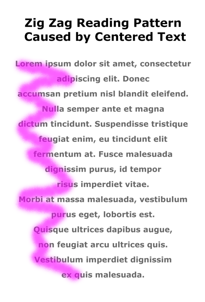
When you center text, the left margin zig zags back and forth down the page, which makes it hard to read in the F-shaped pattern that people prefer.
Instead of skimming down the left margin to look for the highlights and headings, the eye has to search back and forth for the information on the page, as shown in the image on the right.
Learn More
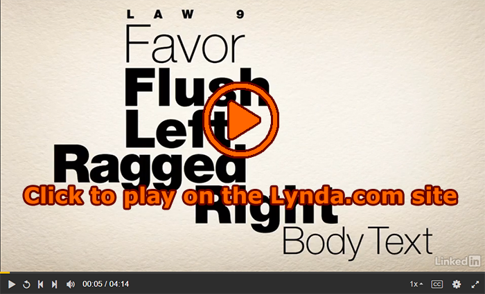
Watch the following Lynda.com tutorial video, Favor flush-left, ragged-right body text (4m14s), for additional explanations and tips on this important guideline for the way that text is aligned on a page. Remember that Lynda.com videos are free to Virginia Tech students with your VT.EDU login. Start at the VT.EDU login page to access these resources.
Note: This video has closed captioning, so it does not need a transcript.
16 Comments
I found this tutorial interesting to think about. Normally when I think about designing a table, it makes sense to me to center the content in a column to make it more visually appealing. However, this does not follow our eye’s typical reading pattern, and could actually backfire because the reader will lose interest in reading the table partway through.
One thing I found to be interesting was the idea of rivers! I had never heard this term before, probably because I’ve rarely used justified text, but I just thought it was a neat piece of terminology. I’m also still a little unsure of when someone would use justified text?
Justified text is used in formal publications. Look at a newspaper or magazine copy and you’re probably going to see justified text. Usually in books as well. Maybe not in fiction. Certainly not in poetry. Textbooks though are usually justified.
This tutorial was about how text should be flush-left and ragged right when it comes to body text. Just like Katya, I found the term rivers when it comes to justified text interesting and it was a new term to me. In one of my labs last semester (Fluids lab), we had to always justify the body texts. I never thought about how distracting justifying text can be horizontally because some lines might have big gaps. This video seemed to mentioned that this type of alignment is good for body text. Does that mean that we should even use flush-left for the header of columns for our Analysis of Writing table? Because in the video when it talks about center alignment, it mentions how it can be used for document titles.
That’s a good question if we should center the titles for the Analysis of Writing project or maintain the flush-left formatting throughout the table. I think that the title “Analysis of Writing” should be centered, but the titles in the different columns of the table should use the flush-left formatting to maintain uniformity throughout the graphic.
Personally, I do tend just just left-align everything. That said most of my writing is online. With responsive design (pages that make the text fit the screen whether it’s on a cell phone or a giant lcd monitor), centered text can be strange: What is nice looking on a smaller screen looks silly on a bigger one when it’s centered.
So with that caveat, use your common sense. You don’t have to completely avoid centered text. It can be nice for variety. Do be sure that you’re consistent. If you have one column heading centered, they all need to be centered. It’s okay to mix some things up too. Perhaps centering the document title and then left aligning the column heading.
I must say that this tutorial was very helpful by bringing up certain aspects of writing to avoid. I have always had a pretty good idea that centering text is not always useful for other people to read. I have always considered the centering of text to be a minimal choice of writing format, and to only use when most advantageous. For example, centering the title of a page would be most appropriate. I usually keep the main bodies of my writing in alignment to the left. This tutorial reaffirmed the practices of proper formatting when writing.
I found this tutorial interesting. It makes sense that the information should be placed to the left, the beginning of every line will line up and it looks better. The only times I have really seen centered text is with poetry or other things like that. One instance where I center text is when working in excel or a table, I usually have the column title centered and the information beneath it on the left. This is just personal preference and I think it looks good. But overall, I enjoyed the tutorial and found it interesting!
I agree with you Thomas that the centering of text in tables looks better. Since tables are already condensed and organized I’m not sure it really benefits to have left alignment of words as it would when you have large bodies of text. This video didn’t really address the formatting of pictures in documents. It is my preference to center them. Even when I take notes I think it is easer to have them centered when I am reading. I wonder if there is research on the best place to put graphics? Overall, this was a good tutorial that explained how to format a lot of examples such as posters and business cards.
Prior to viewing this tutorial, I favored centering my text in charts and tables. After viewing this tutorial and recalling the F-shaped reading pattern previously mentioned, it makes more sense as to why flush left alignment is preferred. While aligning text to the left is not always the most visually appealing, it certainly makes documents easier to read through. I also enjoyed the discussion about justified text alignment as I have never found a situation where this type of alignment was suitable. After viewing this tutorial I will certainly keep these tips in mind when formatting text for future documents and assignments.
I agree! I’ve always kind of wanted my texts to be centered in any tables that I make, but now after watching the tutorial I can see how for different circumstances flush left and flush right could be important. I personally think either justified or flush left looks the most visually appealing, but I can also see that the flush right can be used for certain things. This also makes sense because for my professional bio statement there were weird gaps that were in between the structure of my sentence. However, now I understand that it is just because of the format of the document.
I found this video very informative. Thinking back, I can remember times when I would use center alignment in tables, charts, and shorter pieces of writing. After watching the video, and recalling the F-shaped reading pattern, I agree that flush left text is best. I often used justified alignment when writing lab reports, but I had never noticed the “river” affect. This video is also making me rethink that as well.
These videos are always my favorite. I feel going into the video that concepts are intuitive but after watching the video I realize that I only knew a small portion of the information. I appreciated the examples given in the video of when to use the different text alignments. I also never never about the concept of rivers before and I now know to be on the lookout for it.
It was a very interesting video. After, I watched the video. I looked my Log, it’s flush left. However, the text was written in the table, it made the left edges are ragged. Then, I have adjusted the width of each columns for making the gaps look a little bit better.
This video was very informative. I always wondered which text alignment is appropriate in my document. I often chose the centered text alignment when it comes to tables because it looked a lot better than left aligned text. In my opinion, the body text should be left aligned and the texts in the table, like titles or subtitles of the table, better be centered aligned. I’m used to that format so that’s why I feel that’s more natural.
I do agree with Youngsu on his comment. I am used to formating tables using centered text. I do that on my lab reports and now that is what actually looks nice to me. This post is helpful because it identifies that major problem with centered text. It is hard to read through it, especially when there is a lot of text.