Skip to content

#InfographicInspiration: The Workplace Is Tired of Exclamation Points!!!

#InfographicInspiration: The Workplace Is Tired of Exclamation Points!!! published on 16 Comments on #InfographicInspiration: The Workplace Is Tired of Exclamation Points!!!

Admittedly, I am guilty of using too many exclamation points in my emails and texts, but I do try to avoid them in what I write in the workplace. It turns out that is the right choice, according to the Business Insider article Stop Using Exclamation Points At Work!

The article ends with the flowchart shown below, which suggests that most of the time, you should not use exclamation points. It’s a fun flowchart—though perhaps not based on an academic study. Even so, it’s a good reminder and a nice distraction for these last days of class.

Should I Use an Exclamation Mark? from Hubspot

Click on the image for a larger version and a transcript.


#InfographicInspiration: What Goes Into a Letter

#InfographicInspiration: What Goes Into a Letter published on 10 Comments on #InfographicInspiration: What Goes Into a Letter

This week, the daily posts focus on correspondence in general. You will find posts that apply to letters, memos, and email messages—all of which you write in the workplace. Since none of the course projects focuses on correspondence, these posts will cover this important topic.

Most of the time, the workplace letters you write will be formal letters. You will use letters for things such as job applications, official requests to someone inside or outside your organization, documentation of complaints and reprimands, and recognition of special achievements. Here are some more specific examples that you are likely to see early in your career:

  • cover letters that are part of a job application packet.
  • thank you letters to those who are part of your job search (e.g., interviewers, HR staff, those who write recommendations).
  • recommendation letters for those you work with.
  • cover letters (or transmittal letters) that accompany reports and proposals.

In all these cases, you will want a formal letter. You may occasionally write informal letters in the workplace, but it’s typical for informal correspondence to be handled in email messages. Before considering today’s infographic, watch this short video from Rasmussen College to find out “How to Write a Formal Letter” (3m49s):

Next, from the website The Visual Communication Guy, our #InfographicInspiration provides an annotated explanation of what goes into a letter and how to format letters that you write. Note that the image on this page is minimized; here is the enlarged (and more readable) version.

How To Format a Letter, from The Visual Communication Guy


Note: This infographic is explained on the related website, so it does not need a transcript.


#InfographicInspiration: What Do Robots Think?

#InfographicInspiration: What Do Robots Think? published on 15 Comments on #InfographicInspiration: What Do Robots Think?

This week, I am sharing resources that will help you with your resumes, cover letters, and other job application materials, based on a request included in the midterm evaluations you submitted.

One of the sad truths about the job search is that sometimes you get rejected by someone who does not more than glance at your resume. Worse yet, you can get rejected without a human ever looking at your resume.

Today’s infographic from hireright.com invites you to “Meet the Robots Reading Your Résumé” and provides some details on how to prepare your job application materials so that the robots like them.

Meet the Robots Reading Your Resume - An infographic by HireRight

You can read more in Beat the Robots: How to Get Your Resume Past the System & Into Human Hands from The Muse, and
Applicant Tracking Systems and Your Resume from Menlo Partners Staffing.

Note: This infographic needs a text-based transcript. See the Optional Accessibility Transcript Activity for more details.


#InfographicInspiration: Progress in an Infographic

#InfographicInspiration: Progress in an Infographic published on 12 Comments on #InfographicInspiration: Progress in an Infographic

Since you are writing your progress reports this week, today’s #InfographicInspiration is the Amyotrophic Lateral Sclerosis (ALS) Association’s Progress by the Bucketful, which shows the impact of the Ice Bucket Challenge.

This visual presentation of the progress in the work to find a cure to ALS shows the same kinds of information typically included in a progress report: what has happened, what still needs to be done (and why), and how remaining work will happen (in their section, Why Stop Now?). How effective does this progress report seem to you? Does it accomplish its secondary goal of inspiring people to continue contributing to the fight against ALS?

You may also consider what you might include and how you would present information if your progress report were an infographic. Yesterday’s post on visual representation has related ideas that can help you think about how you would create an infographic.

Amyotrophic Lateral Sclerosis (ALS) Association’s Progress by the Bucketful Infographic


Note: This infographic needs a text-based transcript. See the Optional Accessibility Transcript Activity for more details.


#InfographicInspiration: Research Steps

#InfographicInspiration: Research Steps published on 24 Comments on #InfographicInspiration: Research Steps

Since you are gathering information for your Genre Analysis Report this week, our #InfographicInspiration for focuses on the research process. The image below breaks the research process into eight steps that are typical for academic projects.

Your Genre Analysis Report probably includes the steps in this infographic, except perhaps the final step “Repeat.” It’s important to realize that research, like most creative projects, can take a much messier route than the infographic suggests. People rarely march through research in a 1-2-3 order. They back up, jump ahead, and redo.

As you look at this infographic, compare it to the way that you usually work. You might comment on any of the following:

  • How is your process the same as the one in the infographic?
  • How is your process different than the one in the infographic?
  • What steps do you follow that are not represented in the infographic?
  • If you created a visualization of your research process, what would it look like?
  • If the infographic inspires you to talk about something not covered in these questions, tell us about it.

Infographic: Steps in the Research Process
Click for larger image and transcript


#InfographicInspiration: Overused Words

#InfographicInspiration: Overused Words published on 19 Comments on #InfographicInspiration: Overused Words

If you’re like me, you have a few words or phrases that you find yourself using too much. When I make my final passes through anything I write, I watch for these overused words and rephrase whenever possible.

I’ve become pretty good at finding my overused phrases. If you have difficulty finding them in your documents, try pasting the entire text of your document into a word cloud app like TagCrowd. Set the tool to “Show frequencies” so that you can see the number of times you use the words.

Be smart about your word clouds however. It’s normal for words like the topic of your document to be repeated frequently. Suppose you’re writing a proposal for a new way to manufacture widgets. In that case, you’d expect the word widgets to be used frequently. There would be no need to change it.

What kinds of words are you likely to want to change? That’s where today’s #InfographicInspiration comes in. The image shows 44 Overused Words and Phrases to Be Aware Of and suggests alternative words to use instead. One more tip: You want to have variety in your documents, but don’t let this list of overused words and phrases block your writing. Go ahead and use whatever comes to mind in your first draft. Use the list when you are revising and editing.

If you want to comment, share details on what you always check for when you proofread. For me, for instance, I have to check my use of not/now. I am notorious for typing not when I mean to type now. Point in case: I once sent out a message to everyone who used our company’s software announcing that “The new release was not available.” Talk about embarrassing! What mistakes do you always double-check for?

44 Overused Words & Phrases To Be Aware Of (Infographic)
Source: www.grammarcheck.net


Note: This infographic needs a text-based transcript. See the Optional Accessibility Transcript Activity for more details.


#InfographicInspiration: Scheduling with a Gantt Chart

#InfographicInspiration: Scheduling with a Gantt Chart published on 27 Comments on #InfographicInspiration: Scheduling with a Gantt Chart

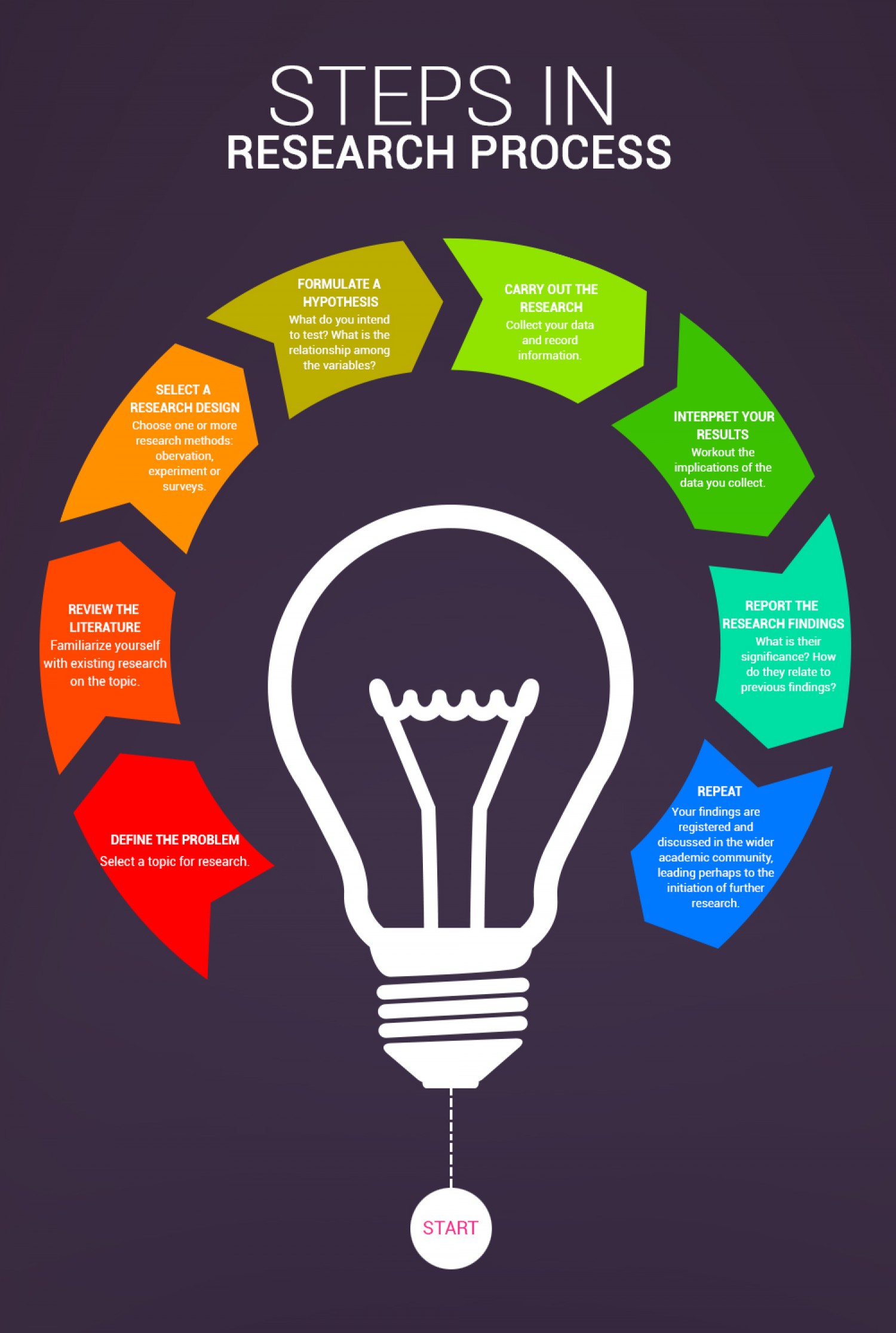
The Short Report Proposal you are working on requires a schedule for the work you propose. Document design and readability play a role in the way you communicate your schedule. Explaining the information in paragraph form makes it harder to read. Consider this example:

At least two weeks before the bowl game, decide on a time, date, and place for your party; and then send out party invitations. Two weeks before the party, focus on preparations that can be finished in advance and then pulled out quickly when game day comes. This preparation includes: Buy and/or make maroon and orange, football-themed party decorations; Find your coolers, buckets, or tubs for drinks, or borrow them from friends; Buy beverages (e.g., beer, Soda or other non-alcoholic drinks, water); Buy disposable plates, bowls, cups, cutlery, and napkins; Gather your serving platters and snack bowls; and Gather or buy bottle openers, if your beer is in bottles. If you can store ice in advance, buy ice, lots of it. The week before game day, plan food for the event, and then arrange for catering, or plan to shop for ingredients and make whatever food can be made in advance yourself. Also plan seating arrangements for the party, borrowing any additional chairs or tables needed, and gathering resources in your home. A few days before game day, do a deep clean of your party location, including cleaning furniture, ice chests, refrigerators, and so forth. The day before the game, spot clean any areas that need it. Put up decorations and set out containers (bowls, platters, ice chests, etc.) so that they are ready to fill. The day of the game, turn your attention to finishing food preparations. Be sure to keep food at a safe temperature before and during the party. If you did not buy ice in advance, buy it an hour before the party begins. Once your guests begin to arrive, relax and enjoy the game.

UGH! You don’t need to read through that oversized paragraph to recognize that the details of the schedule are hard to follow. Document design can improve that information. You can revise the information in many, more readable ways, such as

  • a table that lists dates and deliverables or tasks completed.
  • a calendar with deliverables and tasked completedwritten on the planned dates.
  • a workflow diagram that lists expected dates along with the tasks.

Another popular option is using a Gantt chart, and that is the topic of today’s #InfographicInspiration. The information below from Wrike Project Management Software gives you background and general information on how Gantt charts work. Come back on Saturday for the #WeekendWatch, which will demonstrate how to create a Gantt chart in Excel.

What is a Gantt Chart? #infographic


A transcript of this infographic is available.


#InfographicInspiration: Persuasion and Storytelling

#InfographicInspiration: Persuasion and Storytelling published on 13 Comments on #InfographicInspiration: Persuasion and Storytelling

If you think about it, you already know that storytelling is persuasive. Picture any commercial that you’ve seen that really caught your attention. Chances are high that it included some kind of a story. It might have included people telling a story as a testimonial for why the product or service is good, or it might depict a story that demonstrates why the product or service is good.

Storytelling can work well in professional writing too. When you work on a proposal for a client, you want to include details the demonstrate why your ideas are the best ones. This week’s #InfographicInspiration outlines why storytelling can be so persuasive for readers.

Storytelling: The Most Effective Way to Engage and Persuade People
Larger image available


Note: This infographic needs a text-based transcript. See the Optional Accessibility Transcript Activity for more details.


#InfographicInspiration: Punctuation Rules

#InfographicInspiration: Punctuation Rules published on 10 Comments on #InfographicInspiration: Punctuation Rules

Lots of handbooks explain how punctuation works, but who wants to read pages of information in a grammar textbook? Today’s #InfographicInspiration won’t eliminate the need to look up how certain rules work; however, it does provide a nice overview of the primary ways that most punctuation marks are used.

I suspect that you will be familiar with a lot of the rules, especially for marks like periods, commas, and exclamation points. Other punctuation marks may be new to you, such as en dashes and em dashes.

If you find anything new to you or need more information on an exclamation, try searching for details on the information on Punctuation on the Purdue OWL site.

69 Rules of Punctuation
Click for larger image and transcript


#InfographicInspiration: Choosing Colors

#InfographicInspiration: Choosing Colors published on 38 Comments on #InfographicInspiration: Choosing Colors

Using a Color Picker

Color Cop Icon
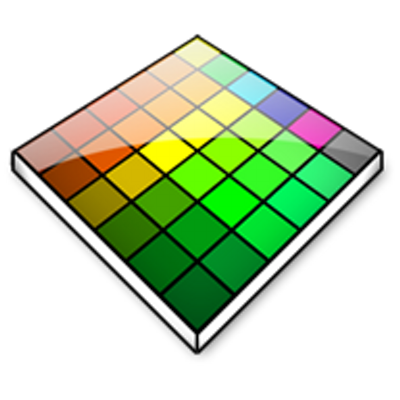
Often you see images on a website or photo that you like, but you may not know how to get the exact RGB or Hex codes to use them. You can use a color picker app to identify colors on your screen.
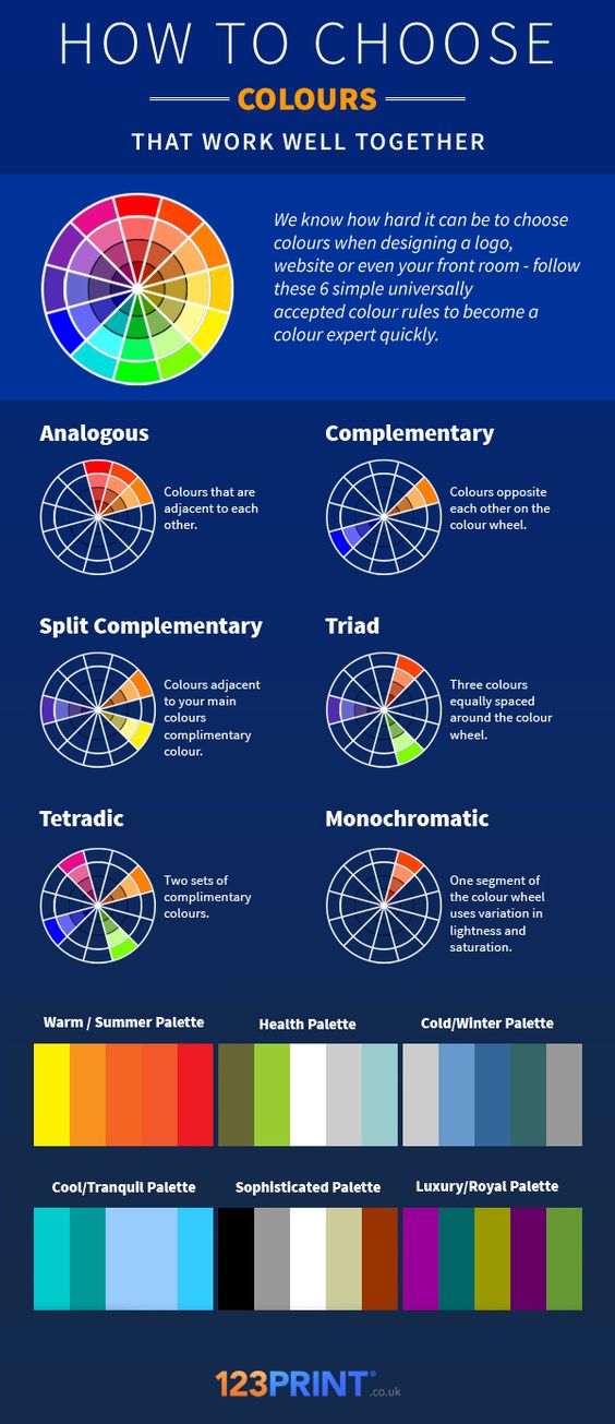
I use Color Cop on Windows and the Coolors Generator in my browser. You can find other options (free and paid) for Mac and Windows by googling for "color picker."

Today’s #InfographicInspiration focuses on colors. When working with tables, you can use shading and borders as part of your document design. Chosen well, colors can greatly improve a project, making the information more readable by creating contrast and highlighting important details. Chosen poorly however, colors can make a project harder to read because they lack contrast or distract from the information.

Think about how you use a highlighter in your notes or a printed book. If you highlight an entire page, essentially nothing is highlighted. Nothing can stand out. You have to have contrast between highlighted words and the rest of the page. Likewise, if your highlighter is drying out, it can leave very faint marks on the page. Again, there isn’t enough contrast between the elements on the page.

To make the most of your color choices, consider the ideas in today’s infographic. Any one of the ways of linking colors can make a nice contrast (e.g., choosing complementary or triadic colors). At the bottom of the infographic, you’ll find color palettes of combinations that work well. Do note that the infographic is British, so it uses British spelling.

How to Choose Colours That Work Well Together

Transcript for this image is available.


Primary Sidebar