Using a Color Picker
 Often you see images on a website or photo that you like, but you may not know how to get the exact RGB or Hex codes to use them. You can use a color picker app to identify colors on your screen.
I use Color Cop on Windows and the Coolors Generator in my browser. You can find other options (free and paid) for Mac and Windows by googling for "color picker."
Today’s #InfographicInspiration focuses on colors. When working with tables, you can use shading and borders as part of your document design. Chosen well, colors can greatly improve a project, making the information more readable by creating contrast and highlighting important details. Chosen poorly however, colors can make a project harder to read because they lack contrast or distract from the information.
Think about how you use a highlighter in your notes or a printed book. If you highlight an entire page, essentially nothing is highlighted. Nothing can stand out. You have to have contrast between highlighted words and the rest of the page. Likewise, if your highlighter is drying out, it can leave very faint marks on the page. Again, there isn’t enough contrast between the elements on the page.
To make the most of your color choices, consider the ideas in today’s infographic. Any one of the ways of linking colors can make a nice contrast (e.g., choosing complementary or triadic colors). At the bottom of the infographic, you’ll find color palettes of combinations that work well. Do note that the infographic is British, so it uses British spelling.
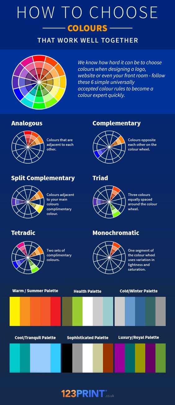
Transcript for this image is available.
38 Comments
I found this post super helpful! I never really thought about how the colors chosen for a project can really make it or break it. If the color scheme that is chosen is really random and the colors do not go well together, it makes it more difficult for the reader to be able to focus on what is written. I did not know that there were so many different color schemes that could be used (analogous and triad to name a couple). I feel like I have never heard of the triad color scheme because the colors are just so different because they are spaced away from each other, but in the end I guess they work well together. I never realized how much the formatting and color scheme can help or hurt a project. This is because the visual appeal of something is what helps someone want to look at the project. I am going to have to use a color picker website to help make sure the colors I use work well together for my project.
This was really helpful as I am also currently taking a GIS course where we have to make a lot of different maps and represent as much data as possible as clearly as possible. Using colors, both selection and position/shape are a huge part of that and can be both helpful and aesthetically pleasing. Its crazy how the mind works when viewing something that has been thoughtfully composed and colored. Great idea for this upcoming assignment. Thanks!
I appreciated the example used about the highlighter because it was really relatable to me– I know there have been times where I get carried away with the highlighting, then when I go back to study I feel overwhelmed. Well, it only makes sense that the same goes for tables! I found the infographic really helpful because while I have heard of these color schemes before, I did not fully remember them. I will definitely save this post for future reference. I think it is also important to keep in mind that the type of color scheme you choose really depends on the use of the table, what information you are trying to convey, and your audience. I feel like there are even instances where using the wrong color scheme might even come across as inappropriate or offensive, which is especially important to be sensitive to in the work environment.
This post is really helpful! I’m not a very artistic person–I can tell when something looks good and cohesive, but I wouldn’t be able to create it myself. This infographic will definitely be put to use when doing my table, because it very clearly lays out color combinations that work well together. I think that for this project, one of the three color wheels will be best. One for column headers, one for row headers, and one for the cells. However, I wish that this graphic had some sort of information on which color schemes are considered the most “professional”. I can definitely point to certain combinations that would fit these requirements, like green & red for combination, but would not be good to use in a professional setting. Does anyone know which colors would be the best to use? Is using company or school colors appropriate?
I think the color scheme of your company or school would work. If you were presenting within the company, I imagine your presentation would have the company logo somewhere on it and the color scheme should be cohesive to that. I think it shows loyalty and dedication to your company.
This was a neat infographic. I actually learned about contrast when I was at IBM. The UX team had to make sure the color scheme had proper contrast so that those with sight limitations could still use the product. It was interesting to learn how design work considers those with disabilities to make products that are accessible to everyone. I will definitely use this concept when adding color to my table.
I agree with the fact that colors, if used correctly, can impact a presentation of data greatly, but a lot of the time if you are on a time crunch, taking the time to try and generate an effective color scheme might not be the best way to use your time effectively. Granted, putting data in a color scheme that shows which numbers or parts are the areas of interest can lead to easier analysis, and thought processes to execute the presentation, or paper. Another point I think is important when using color schemes is to make sure there is a purpose to using the different colors. On bar charts in excel for example, you can set each different column to a different color (it may even be preset like that) but there is really no significant difference between those columns (usually). So in this case having the same color would probably get your point across better than distracting the reader with a plethora of colors.
I found this infographic and supplementary information to be very helpful. I have always heavily considered the detail of color when working on any piece of work. I understand that using too much color can distract the reader away from what is really trying to be communicated. However, I have never considered the effect an arrangement of colors can have on a piece of work. The color rules listed above give me an understanding of what colors work best together, as well as what combination of colors will have a corresponding targeted result. I cannot wait to put these color rules into practice for my project!
This image was great! Growing up, I’ve always liked matching colors and seeing how they contrast each other, but I have never seen those types of color wheel pie charts. Those are definitely something I will refer back to in the future. Another thing that was said was “If the whole page is highlighted, nothing stands out”. That is true. I have had teachers who highlight the important parts of paragraphs in books and they end of highlighting so much that they have to go back and underline the crucial parts with pencil in order to know what actually caught their eye. Other people use three to five different types of colored highlighters to teach or present, but this ends up being too much color and is super confusing.
I think knowing how to choose colors that work well together is an important skill to have. Choosing the proper color scheme can make any document look more professional and interesting. However, the importance of choosing color schemes is not limited to documents. Picking colors is also a very important skill when developing visually appealing applications and websites. For example, Google has released a set of guidelines which they call “Material Design” that helps developers choose color schemes for their Android applications.
I learned a lot about this post because as I was making my professional bio, I was seeing what color scheme worked best and deciding which colors worked well with one another. I ended up choosing a grey and blue scheme, but it’s helpful to see the colors on the color wheel that can be complimentary to one another. I think the balance with using color is not using too much as the article stated, but also using the correct shade because if it’s too strong then the words get lost and if it’s too faint then it looks as if the printer ran out of color. Personally, my favorite color scheme is monochromatic and using different shades of the same color because there’s enough contrast, but not too many colors that overwhelm the page.
I never considered how the colors of tables and different infographics affect how the information is conveyed. I think I have always seen tables or visuals using analogous colors, just like many of the table styles in Word. I have never thought about the using complementary colors in visuals. I think the most important takeaway is to have a color scheme that enhances the analysis project, rather than detracting and distracting from the information.
During my internships and even with school projects, I have had to create tables to portray data in presentations. Using tables with various numbers, columns, and rows of information often get convoluted and hard to read. I try to add color or boldness to text to make certain things pop for presentations to highlight the pertinent information. Although I already apply color, I often have a difficult time deciding on which colors work best together and are visually appealing to the audience without taking away too much from the presentation. I never have heard of the six different methods to choosing colors but will definitely refer to it in the upcoming future.
Although the color used in an article, paper, etc may not seem as the most important thing to emphasize when you write, I think this article brings up a great point on how using color can help highlight things on a paper. Last week we learned about the “F” pattern that people read when reading articles and papers. I think using color could help highlight parts of the paper that are not in this “F” pattern in the paper. Before reading this article, I used to think of color as just as way to make your tables look better. I used to shade tables on Excel different colors so that the table could look better. I think that the article has taught me that color and shading can do a lot for the effectiveness of an article.
Obviously the colors you choose for any type of presentation are important. You do not want a dark background with dark words or a light background with light words. It is about a contrasting and complimenting palette. The infographic was informative about what colors go well together. Personally, I think the complementary color wheel works best. Especially for a presentation, it is important to have some color but not to overdo it. There is nothing worse than a website, logo, or power-point that has variety of colors incorporated in the design. It makes it look messy and unprofessional. Also, the colors you choose are important in itself; you should choose colors that correspond with the tone you are trying to convey. Like the infographic describes, creating a website based on summer, you should not choose the cold toned palette.
I think that this infographic was very helpful. I agree that color choice greatly affects the design and the project overall. It makes a good point about balancing how much information you highlight in order to maintain contrast. I knew about complementary colors but I was not aware of the other color categories. I think that the colors in the palettes presented in the infographic go well together and really fit the description they were given. I will definitely use the information presented about using colors in projects as well as the six color rules in future assignments.
The color scheme generator that I, and most of my designer friends, use is Adobe Kuler (https://color.adobe.com/create/color-wheel/). Paletton (http://paletton.com/) is also popular. These tools let you pick one of the color rules that the infographic is talking about and use it to easily generate a whole palette all at once. The interfaces are draggable so you can easily adjust the palette until you find one that suits your purpose well.
Additionally, the “vision simulation” feature of Paletton is especially handy when trying to put together a colorblind-friendly palette as a color-sighted designer. It simulates what your current palette would look like to someone with various types of colorblindness so you can assess not only how harmonious the palette is to color-sighted people, but also how functional it is for colorblind people.
I am a web developer and I use these tools all the time. Highly recommend!
It is clear that color choices and schemes should not be overlooked. However, one must not overwhelm their projects with colors. This infographic is helpful but I am not colorblind. I would be curious how someone limited in their perception of color would incorporate color effectively. I have never heard of a color picker before this post so, is that a tool one can use when their color perception is off? Is there anyone that is colorblind that wants to weigh in?
Also, As I look at the Android developer’s table from yesterday’s post, I do not see any of the suggested colored pairings. They choose a bright pink and blue which isn’t suggested by the infographic yet still works fairly well. I think this goes to show that it is generally up to your discrepancy.
You can check your palette against common types of colorblindness using a colorblindness simulator such as Color Oracle (http://colororacle.org/), Coblis (http://www.color-blindness.com/coblis-color-blindness-simulator/), daltoniser (https://freeshell.de/~oesser/daltoniser/), vischeck (http://www.vischeck.com/), etc.
Note that besides the various types of colorblindness, it also varies in intensity/severity, so even something that isn’t distinguishable to someone with severe deuteranomaly it may still actually be distinguishable to the majority of people with that type of colorblindness.
As for how colorblind designers themselves can create a color scheme or palette, this article provides some insight: https://webdesign.tutsplus.com/articles/designing-for-and-as-a-color-blind-person–webdesign-3408
Basically, they trust color theory (color wheel, as in the rules described in the infographic), borrowing elements of color schemes from elsewhere, and creating a palette out of colors that they can see clearly (such as a monochromatic or HSV-varied scheme).
This is a very helpful page. I was reading in the middle of the page, it reminded me on the assignment Analysis of Writing in Your Field. I have looked through this assignment, due to we are required to build a table those color highlighter is super help for a table design for distinct the different content and the important key elements.
I found this infographic very interesting. I did not realize how important colors were. But it makes how certain colors compliment each other while others do not. I can really relate to the importance of contrasting colors. Whenever I take notes, I usually use 4 different contrasting colors that each mean different things. This way when I look over my notes, I can recognize the color and know what kind of note is there.
I’ve never seen formal color palette groups like these that were listed. I’ve had a general sense of complimentary and contrasting colors, but this makes much more sense when to use which kinds of colors to pick in a theme. The diagram explains which colors compliment and contrast each other, as well as which colors form a theme, but it doesn’t discuss how tones of the color wheel are used to accent content and headers. I think it’s important to alternate tones, especially in a monochromatic theme. Headers usually take on a darker tone than content, especially in background coloring.
Before reading this post I always used Microsoft’s color pallets to help me with my color schemes (they can be found under Design -> colors). Now I see where a lot of these color set-ups come from. Almost all of the color schemes follow one or more of the info graphic’s color rules. For instance, the color scheme “slipstream” uses the color rule complementary and the color scheme “Blue” uses the analogous format. Upon learning these color rules, it is evident that they are used all over the place. Obviously, these rules are used most prominently in advertisements, in order to catch one’s eye, but can also be seen through a lot of logos or names of companies/restaurants. I have already shared this info graphic with several of my friends and plan to use it myself for future assignments.
This post is super helpful for people in every major because colors can add an extra flair to any document when done right. as well as making the document easier to read. In my area of study, which is software engineering, picking colors that work well together can really help make an application look more professional and easier to navigate. A book I really recommend is Color Index 2 by Jim Krause, which is a mini handbook that includes thousands of color combinations to choose from.
I honestly never knew that a color wheel existed before so knowing about it is surely interesting. I think this next writing assignment really needs to apply the information given as we are dealing with table structures and as a reader I my self tend to skip many things when skimming the table especially when it is a dull one with random color combinations or when it is just black and white. Besides creating an eye-popping visual, colors do have a big role in readers to help them focus on the table and understanding the main points described in it but using random color combinations might do the opposite. I think I would refer to this post when I am starting to design my Analysis project to make sure I am not creating a mess with the color choices.
This infographic is very helpful in showing the impact that color choice can have on projects and presentations. When making a presentation colors can really help with directing the people viewing the presentation to the important information on a slide and help keep the viewers attention. This information will help with the analysis project through providing another way to organize the project through using colors to direct the viewers eyes to different parts of the project.
I think that effective use of color is an extremely important topic. A lot of times I find that infographics, flyers, or other forms of visual media use too much color and it makes it impossible for the important information to stand out. I’m a Geography major, so I frequently have to make decisions about color choice when making maps, and the most important thing for color choice in a map-making scenario is ensuring that the most important elements of the map uses the most eye-catching colors on the map.
I find this infographic very helpful and it’s definitely something I would refer to when working with tables to make it more readable. Even in the text editors, color coding is very important since it makes the reader or author notice what the line of code is by just looking at the color of the line. Also, using the colors effectively according to themes it’s going to be used is a very brilliant idea to make it look more professional. I will surely use this technique when I work on the assignment.
There’s no doubt colors are a great way to convey a message. Different colors are attached to different emotions and I believe most of us have been taught the color wheel; which colors are opposite and those that go together. This infographic is a great reminder not only as to how colors should be used, but to what extent. As an artist, I’ve always found the use of colors as a big challenge and try to stick to the monochrome colors, but there is no denying that colors add flavor and good vibes to everything.
I have always had trouble determining what colors go well with each other. This info-graphic is a very useful tool that will help me decide which colors look good together and which do not. I feel as though this will become very useful in the future when I need to design presentations, or any other sort of visual presentations.
Additionally, it is interesting to see the color schemes displayed in this graphic because I have begun to notice them being used in other logos and graphics. I look forward to using these color schemes in the future.
That is really helpful for me, I always use one color to take notes. Most of the keywords are not easy to be found, and maybe I need learn more from this article in order to take notes efficiency.
Im usually hesitant to use colors in writings as I don’t want it to appear childish or unprofessional. I’m glad we read this infographic as it explains how to incorporate color to highlight important information and how to use this color properly. I like how the information is also presented using color, as it reinforces the message in the infographic. I also really liked the analogy of highlighting in notes; I can definitely see how you can over highlight and fail to emphasize things. I will definitely keep that in mind when I look at my overall document.
I do think that this infographic is more relevant to independent pieces of work such as infographics or posters rather than writings made for a company or group. In these cases, I think its best to stick to the color theme of the company or business so that everything seems standard and connected.
Personally, there is nothing more irritating than trying to read something that uses poor color choices. This is especially true for PowerPoint presentations. (blue hyperlink font does not work with a black background!) Therefore, I always try to keep this in mind when creating any kind of document that incorporates color but the idea of using a color wheel had never crossed my mind. I honestly don’t think I have even looked at a color wheel since my last art class in middle school. I believe that this will be yet another helpful resource in the future, both academically and personally.
I absolutely agree that colors in a table or general document design help to make that piece stand out. I use to always struggle with how to make tables look better when they were going in a presentation. It wasn’t until I started playing around with colors and shading that I felt I could make an appealing display. I’ve made dozens of spreadsheets in my internships, and I always found it easier to navigate and look through though spreadsheets when I used borders, shading, etc. One current example of how I apply colors to work I do is with my senior design project. My team gives weekly presentation to our faculty advisor, and we often include tables and charts. To make those tables and charts look more presentable, we often use shading to help break up the rows and columns so the eye can see them better.