Lynda.com Login Help
Lynda.com videos are free to Virginia Tech students with your VT.EDU login. Start at the VT.EDU login page to access these resources.
One of my favorite ways to talk about strong document design is the CRAP method. CRAP stands for Contrast, Repetition, Alignment, and Proximity. Using all four of these elements helps give your work a polished appearance and catches readers’ attention.
This week’s #InfographicInspiration (from Paper Leaf Designs) gives you a quick overview of all four elements. It is worth saving for future use, and try applying it to your professional biography assignment before you turn it in on Monday.
For a more detailed explanation of the CRAP elements, watch the Lynda.com video, Understanding the PARC system (Lynda.com was apparently afraid to say CRAP, so they spell it backwards).
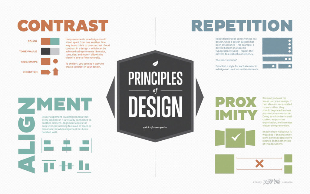
Note: This infographic has a text-based transcript.
14 Comments
This video about the PARC system I could really helpful. The P stands for proximity, A stands for alignment, R stands for repetition, and C stands for contrast, Proximity is very important because it me similar items will be group together, meanwhile if two things aren’t similar they won’t be grouped together. This is very helpful for the professional bio because I will make sure that the sections I made all contain related information in order for my bio to have proximity. For alignment it means to make sure that everything is spaced out the same distance for a visually appealing sight. For my professional bio I did this when I made my text justified and I made sure that my photo lined up well with the text. Repetition means to reuse similar formatting to keep things consistent. Therefore, for my professional bio, if one my headers is bold, Times New Roman font size 12, then all of the headers should match that design aspect. Finally, is contrast which means to make sure that items that are different stand out from each other. For my professional bio I can add contrast by using black text on a white background. I can also make my headers bold in order to separate them from the rest of the text. The PARC method will really help me in the future to make sure my papers/ assignments are visually appealing.
I too think this is a helpful infographic but I was having trouble seeing its application to our professional bios before you broke it down. The video seemed to focus on the graphics aspect of it in association with logos and such which is not currently relevant to me. However, I now have a better understanding of the CRAP/PARC methodology in written documents, like my professional bio. I think having work that is aesthetically pleasing is extremely important in order to appear as professional as possible as well as engage your reader. I want my reader to want to read my work.
I found this infographic to particularly helpful for creating visual interest in the professional bio assignment. I found that my bio was lacking in appeal; it was just the few paragraphs I wrote about myself and that was it. However I can use some of the elements of this system to make my bio more visually appealing. For contrast I can use contrasting font styles (serifed vs non-serifed) to create headers and differentiate between sections. For proximity, I can make sure that all the different topics I cover in my biography are grouped together so that it flows and is more cohesive. Finally, for repetition I can repeat formatting structures for the different sections of my bio like reusing the same fonts for headers and indenting my paragraphs the same way every time. This method gave me some great ideas on how create visual interest for my professional bio as well as future assignments.
This video was very useful, the examples it provided made me really think about times in the past when I have just thrown stuff together and hoped it looked good. I feel like instinctively all of us have a basic understanding of now wanted to much open space, and having balance on a page. In regards to our professional bios, It is important for all of our similar information to be grouped together, maybe in headers to signify this section is about academics, this section is about passions, just to give the reader a clearer idea of what they are reading, and what to expect. With alignment I think for our bios it is important to make sure our paragraphs and headers line up, and either our basic information (name, major, grad year) are aligned well with the picture, because if someone were to look at our bios these would be the first things to catch their eyes. For repetition I think in the case of our bios it is not too big a deal, the only thing would be to make sure the font and size of the paragraphs are the same, as well as the headers. And finally for contrast, again not as big of a deal for our bios, but just to make sure that we are not using 100 different colors, keeping the white background with black text is good, and having a colored picture provide enough contrast.
After I watched the video I thought about all the business cards I’ve seen and I think they do a great job of portraying the PARC method concisely. I never thought that repetition would be important, but when you think about it that’s how a company starts to receive recognition for their brand. Also, small things like distinction between the heading and the body writing can have a significant impact on how the brand is perceived. I think in our professional bios everyone in my group so far has done a good job of alignment and making sure the picture and the actual writing are well spaced out and balanced. I need to think of how contrast can fit into the professional bios and if mine needs a heading, then I can apply the contrast aspect of the method. I think repetition and contrast are especially important for things more like business cards when you are portraying a company in a certain light and it’s a very visual piece. I think for the professional bios, since they are less visual these are still important, but something like proximity and alignment are of utmost importance.
Immediately after reading the headline of this post, I knew what it would be about. Actually, I took the Writing and Digital Media class here at Tech and we learned about this exact same method! I found it useful when I was creating blog posts on Medium.com, but also I have carried it with me in other parts of my life, too. I am not surprised we are discussing it here considering the focus of this class. I will definitely save the image posted on this, though, for future reference! Thank you!
I found the video to very useful and actually quite relatable. I’m a geography major, and lot of good map making comes down to proper placement and spacing of map elements, which according to the video is a big part of graphic design. I definitely think the skills outlined in the video are valuable to know, because being able to brand and represent oneself well is an important ability. I’ve always struggled with making infographics so I think the CRAP method will be especially useful for those.
I keep being surprised by the significance of layout, design, color, etc. in professional pieces of writing. As a science major I am used to scholarly research articles which include very little creativity; however, I now see how the layout of research posters and papers can impact the overall piece. Alignment is especially important for CVs and Resumes – It speaks to a persons attention to detail and organization. A messy looking resume = messy person.
This infographic resembles the acronym it’s using. I understand the design elements it’s trying to convey, but it uses a bunch of junk design elements to do so. Where it could have used meaningful examples and illustrations of its suggestions, the infographic uses basic and rather meaningless shapes. Shapes and colors can lead to a more elegant design, but they have to have a purpose too.
As for the individual aspects of CRAP, I’ve had to practice these a lot in web development. It’s usually good to have contrast in headers and footers from the body, repetition among CSS styles of similar HTML elements, alignment of div elements (literally a block), and proximity especially in elements seen when scrolling from both a desktop and a phone. Applying those to my bio, I might try similar approaches. I think as long as the paragraphs aren’t huge and align well with the surrounding elements, it’ll look nice.
The video was somewhat helpful for me. I think I kind of taught myself to apply the CRAP system to whatever I do like project reports and coding since I came to the college. The design, its consistency and recognizable pattern is what makes it look professional in my opinion. I will definitely use and try to apply the CRAP system to my professional bio statement. It’s going to attract reader’s attention more and that’s what I need for my professional bio statement. It’s written for recruiters in mind so my professional bio needs to be eye-catching.
This infographic really resonated with me because one of my pet peeves when reading a report, article, etc. is when the document design is bad. I have had a couple of labs throughout college, and one thing I always did before submitting lab reports was take the time to make sure my report looked good. I think the power of using contrast is very under-rated because it can provide so much clarity to a document and make it easy for the reader to pick up on things. Alignment and proximity are also powerful tools for making your document look professional. I will take the time to try and make my professional bio look better by using the CRAP method.
I love how the centerpiece of this graphic is the Principles of Design because in professional writing I feel as though the CRAP elements really are standards that can be overlooked in this environment. Having contrast makes the document unique and memorable in terms of information or color. Repetition reinforces a specific idea or theme that is trying to be portrayed and can show a commitment to structure. I agree with the gentlemen in the video that recognition can be the difference between a basic colored document and a multi-colored document. I feel as though these principles would be useful in projects and presentations.
This infographic was very informative and will be extremely helpful in the upcoming months as I complete my Senior Capstone class. This project is a self-paced, semester long project that requires my team to design a new infield for Richmond International Speedway in Richmond, Virginia and develop a construction plan. This project will contain mostly technical information and will be graded by my professors, as well as industry professionals. So, besides the quality of the content, document and presentation design is also extremely important. This infographic will be a good resource when the time comes to create these final documents and presentations and will hopefully allow myself and my team to create final products that catch our audiences’ attention, look professional, and ultimately help set our team apart from the other teams and win the competition.
I agree that the tips given above are very helpful in helping with our document design to make it appealing to the reader, However, if I can add another component to the above CRAP elements I would definitely add an S for Simplicity. The reason is because usually students like me tend to get carried away in designing a document where our creativity sometimes seems to get the best of us. A fair reminder about how to keep our document design as simple as possible would actually make a difference as it can avoid our work from being too over the top.