You can often show trends and comparisons with graphical elements than with text descriptions. Consider the difference between describing the performance of a stock or a portfolio during the last year and showing that performance with a line chart. Here’s an example from the Student-managed Endowment for Educational Development (SEED) 2016 Annual Report. Which seems easier to read and process to you?
Text Description
The portfolio performed relatively in line or slightly below the respective benchmark until the final quarter, as shown in Exhibit 1. We included the Consumer Price Index as a preservation of spending power benchmark to monitor changes in our real returns. From mid-November to year-end, the portfolio significantly outperformed and finished 2016 with an active return of 5.13%. In order to calculate our risk-adjusted return, we incorporated our portfolio’s beta of 1.2 and historical average for yields on the 1-Year Treasury note (1.84%) in order to compute a CAPM-based implied alpha. This calculation resulted in an implied 2016 alpha of 3.11%.
Line Chart
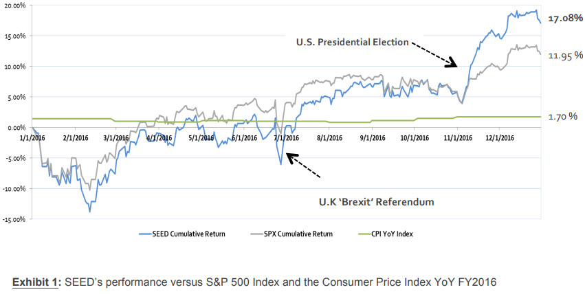
For my money (yes, a pun), the line chart is much easier to understand quickly. In many circumstances, you will include both a text description and a graphical representation. The point of today’s post is that the graphical version is not just an illustration. It is critical to showing the reader information about the topic.
For your #WednesdayWrite, think about how you can add graphical representation of information in your progress report. The infographic below shows a collection of graphics you can use to communicate information. Visit the post How to Think Visually Using Visual Analogies from Anna Vital for a larger version of the image and short details on the various kinds of charts and graphs.
Once you explore the options, add a comment that discusses a graphical representation that you might use in your Progress Report. Talk about what you have chosen, how you will use it, and why it will be effective in communicating with me about your progress.
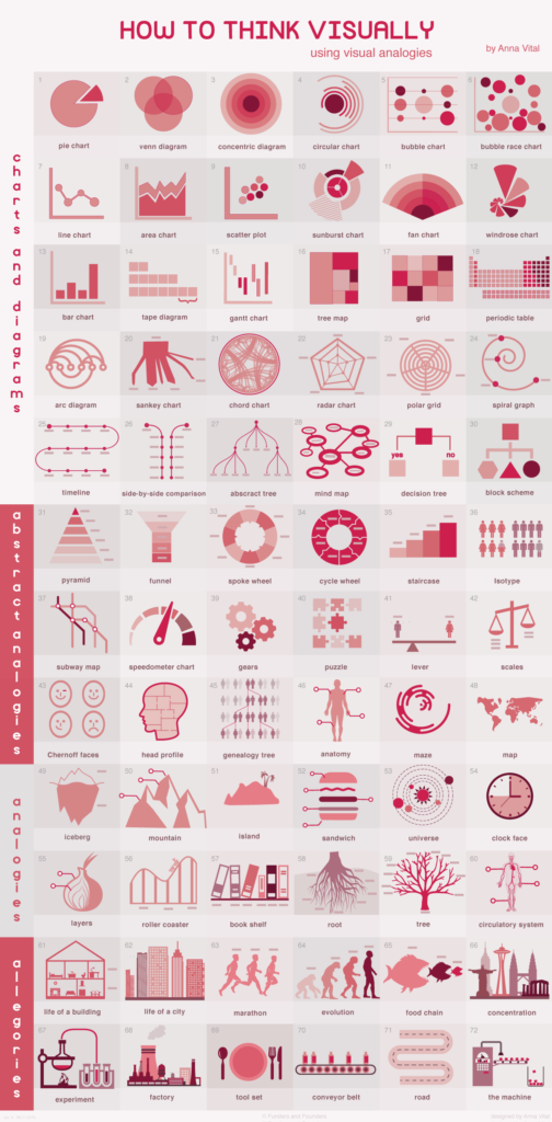
Source: How to Think Visually Using Visual Analogies from Anna Vital
Note: This infographic needs a text-based transcript. See the Optional Accessibility Transcript Activity for more details.
14 Comments
The concentric diagram is a circular figure with multiple layers or, “an onion sliced sideways” as the article describes it. The concentric diagram is used to display a relationship of importance/urgency between items. I have chosen this figure to show the priority of my remaining tasks. I put what I felt to be the most urgent task at the core of the diagram, and then filled in the remaining layers with other tasks of decreasing urgency. I think this graph will be effective in communicating both my remaining tasks and my plan of action. In a quick glance, the reader can see I have three major remaining components, and I would like to accomplish them starting at the core at working outward.
I was thinking that I might possibly add to my progress report a Gantt chart like we did in the proposal. I feel like I can include to old version of the Gantt chart in addition to a new version that has updated dates based on the progress I have made. This will allow the readers of my progress report and me to see if I am ahead or behind schedule for writing my Genre Analysis Report. I feel like something like this might be helpful in a progress report since it will give an updated timeline of where tasks will fall.
I will also be using a Gantt chart in my progress report! I felt that it would be a helpful graphic to include since it is actually something that the audience would have theoretically seen before in the proposal. Because they are familiar with the Gantt chart and proposed dates already, having an updated version that uses the bars to indicate progress on the project will be very beneficial.
I created a schedule that outlined my plan for the remainder of the project using a Gantt Chart.While it was a strongly recommended option for our proposal, I did not use it and I regret it. I think the Gantt Chart shows a schedule a lot better visually than the timetable I initially used. It helps a lot when tasks overlap and being able to visualize what tasks will be happening simultaneously.
Since my genre analysis report is about technical writing there are many components that go into technical reports, however most have a generic structure to them. It begins with an abstract, then goes into an introduction, and materials used. Then presents the data collected, and finally a discussion and conclusion. It is a fairly regimented structure. That is why once you familiarize yourself with the basic format and layout of technical writing it is easy to find what you are looking for in them. There are usually tables, graphs, and figures spread out throughout the paper, as well as references to an appendix which makes it some what tedious to flip back and forth, but that is the most efficient way to present the information. I think the best graphic to use to describe this systematic layering, would be a sandwich graphic. It allows me to explain each section, in addition to throwing extra “toppings” on which include the tables, graphs, and figures.
I think I would choose a simple pie chart because to me it represents what is more important and how much time it will take to complete the task. In my day I make lists of what to do and when to do it, and approximately how much time to do it, but I feel that having a visual representation of my tasks would make them easier to accomplish. Having a visual representation and knowing what I have to do and how much time it will take can make it easier to interpret.
For my progress report, I definitely think that after reading this I should use a Gantt Chart instead of using the timetable that I used in my proposal. I think making this change will not only help me keep track of my progress, but the recipient of my progress report best understand how things are moving along, as well.
I mentioned in my proposal that I was qualified to research medical case reports because I am familiar with scholarly articles. I think a venn diagram showing the overlap and unique features between each of the two types of writing would be beneficial. I can evaluate length, formality, ethical concerns, sections, and other aspects of writing types to easily show how the two types are different.
Another goal of this report is to show how medical case reports will benefit your career and can act as a stepping stone for future success and publications. I think a timeline, staircase, or road would be useful in showing how you start with a medical case report, and eventually you are famous in the medical world. It would be ideal to show what this type of writing can lead to and the “effects” of these reports.
I failed to do this in my most recent progress report but I think I am going to incorporate a gantt chart (as some have already said). I already have a table that was used for my timeline and planning within the project proposal and I think having a modified version of that translated as a gantt chart shown in the reports is a powerful illustrative way to see what is getting done and the progression from each report. This is a great idea and I think will make my reports look a lot cleaner and a lot more professional, thanks!
Most likely, I would continue to use a gnat chart in my progress report. I think the gnat chart is a clear and easy way to display a timeline of tasks that need to be done and the dates that the tasks needed to be completed by. I think I would include my original gnat chart and possibly a second one either laid on top of the original, or simply included below the original. The second gnat chart would show my up to date progress, and my new adjusted due dates for myself. I think this would be a good way to compare my current progress to the progress I predicted to make at this point in time.
I think a standard bar chart is a good way to communicate information. A bar chart can be used to communicate many of these other types of visual analogies and charts and diagrams. It can convey the necessary information that is represented in many of these other visuals and do it with a much simpler image. A bar chart is highly versatile and in my personal opinion is very easy to understand. I would probably use it to graph the number of people who prefer certain types of Project Briefings. However, after reading this it really gave me more perspective on the variety of ways to communicate information and data in a visual manner.
I was using bar chard graph for my progress report and I was wondered if there was any other better options for the progress graph. Since we need a. date, and b. days it was hard to visualize the process through the bar graph. From what I read from the progress report, I would say it is important to communicate with the client to know what the client exactly wants. In this case, I would say use line chard with the detailed not as a date on each dot for the date and value as how many days for each process
One of the recommendations made by a peer in my writing group was to use a Gantt chart instead of a timetable to represent the schedule that I have outlined for myself. I think this is an excellent recommendation because often a graphic is easier to understand than a list of dates. Also, because they are used in scheduling for construction projects I am very familiar with reading and understanding these types of graphics.
I would definitely try to add a Gantt chart instead of a timetable for my progress report. It has a better visual effect than timetable and also if could show what I had done and what are needed to be finished. It’s clearer and maybe more efficiency. Also outside the class it’s also a good idea to make my schedule for life by using a visual chart but not simply the calendar. it applies a clearer visual understand about what’s coming next. It’s just good to make schedule and make things being organized.