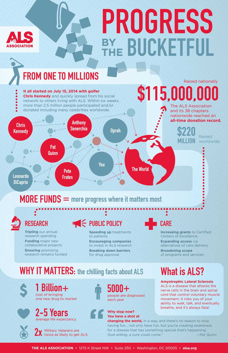
Since you are writing your progress reports this week, today’s #InfographicInspiration is the Amyotrophic Lateral Sclerosis (ALS) Association’s Progress by the Bucketful, which shows the impact of the Ice Bucket Challenge.
This visual presentation of the progress in the work to find a cure to ALS shows the same kinds of information typically included in a progress report: what has happened, what still needs to be done (and why), and how remaining work will happen (in their section, Why Stop Now?). How effective does this progress report seem to you? Does it accomplish its secondary goal of inspiring people to continue contributing to the fight against ALS?
You may also consider what you might include and how you would present information if your progress report were an infographic. Yesterday’s post on visual representation has related ideas that can help you think about how you would create an infographic.
Note: This infographic needs a text-based transcript. See the Optional Accessibility Transcript Activity for more details.
12 Comments
This report seems very effective in telling me what has already been accomplished in regards to raising money and treating ALS. The info-graphic clearly displays what has already been done for ALS. It is easy to follow because it follows a chronological order. It starts with how the money was raised, then goes to how much was raised, then to what the money was able to do in regards to ALS, and then says why it matters to keep raising money for ALS. The only issue I have with this info-graphic is I do not think it goes that in depth into what still needs to be done. This is most likely due to the fact that it is a short info-graphic, meaning it can not get too specific. Finally, it doesn’t go into specifics on how the rest of the goals will be accomplished (besides donating more). It could give some places to volunteer to help people with ALS, or something along those lines. I do think this info-graphic was effective in inspiring people to raise awareness and money for ALS research.
One of the characteristics of this infographic that makes it easy to follow is also kind of hard to notice because it is so effective. There is a lighter blue line that flows through the graphic that kinds the reader through the progress report. Having this path/timeline sort of approach is good because it makes it easier to see what has been done and what is left to do.
I do agree with Daniel that there could have been more specific plans for accomplishing the goals, since simply donating money can seem like a vague and impersonal action. Having some other specific actions people could take to support those with ALS could better encourage them to support the cause.
It is amazing how much I really take for granted infographics like this. Usually, I will look at them and take in the message it is trying to send, whether it be for ALS, cancer, diabetes research to global issues such as global warming, policy changes, or big world wide events. Really going through this course, and trying to understand what makes good technical writing shows that there is so much more to these inforgraphics, than just throwing information on a page. It takes a lot of planning, or the need to focus on core issues, or the main points the author wishes to portray.
When I look at this infographic, what I see is the amount of money that has been raised for this cause, and why I should care. I think these are two very important points, and depending on the audience there are probably different versions of this infographic that display different ideas. Overall, I think it is well thought out, and creative, and I wish I had the ability to put something together like this, because it really helps bring light on issues in a reader friendly way, that almost anyone of any age can read, interpret, and understand.
I think this is fun progress report for the public but personally I would not want to receive this as an employer. While it is fun to look out and pretty detailed if you break down each section/header, it took me a while to figure out where to start and (like Danielle Ott said) what still needs to be accomplished. A lot of things are jumping out at me and its very distracting. I would prefer something more concise and specific, maybe with more lists. The elements I would take from this infographic would be color contrast to represent what has been finished and what still needs to be done. I also like the shapes with connecting arrows to show the flow of progress.
While I agree that the color scheme is a little bit distracting, but the logo for the ALS foundation is red, so it makes sense to see that make such a big appearance in this infographic. I also think that this kind of progress report is meant for the public–it was the public doing the ice bucket challenge. Just like we’re not doing infographics for our professional progress reports, I don’t think this was meant to be professional.
I think the Infographic had a lot of useful information that was portrayed to the reader, however I also think it was a little busy looking. I think if it didn’t have as much information spewed all over the place then it would look more cohesive. For me, a way to evoke emotions is through pictures and maybe if a picture of someone that has ALS would inspire people to help and donate to the cause.
I thought that this infographic gave readers an array of great information, however I found that the arrangement of the information to be a little backwards. I have obviously heard of the Ice Bucket Challenge, however, I do not know much about ALS and some of the facts surrounding this disease. If I were putting this graphic together I would have switched the second and third section. I think by describing the disease first would put it into perspective for those like myself who are unfamiliar with the disease and its effects as to why it is so important to continue to raise more money for research, public policy, and care of those affected by ALS.
This infographic is a very aesthetically pleasing graphic that allows for a reader-friendly means of documenting progress for donations and research focused on ALS. I remember when this viral trend took off and everyone was doing the “ice bucket challenge”. My friends and I even participated in the challenge. What I loved most about that trend, was the way social media had such a large impact in spreading the word so fast. It seemed as if this viral trend took off overnight practically. But regarding the graphic, I like how the image incorporated arrows to keep the flow of the image along these arrows. Also incorporating small artworks and large, bolded numbers to emphasize those statistics. Also, anytime you can incorporate Leonardo DiCaprio and Oprah in the same graphic, you’re bound to get more intrigued readers because of the celebrity factor.
This is an interesting picture for people who want to know something about ALS and also it has a fun looking. But for me, I think this just has too much information on it and it’s too ‘fancy’ for me to read. So I may not use this kind of structure on my progress report, it’s just a little hard to read and follow on the picture. If I would use a infograph, I may use something simple and clear to make my point.
While I found this infographic to be very informative, I also found it to be somewhat confusing organizationally. I feel like the infographic would of made more sense in reverse order, so instead of explaining what ALS is and the big expense of medical research on the bottom, I think they should of put that at the top, and then have explained the ice bucket challenge on the bottom. It just seems to make more sense to outline the problems before the solution. Also, if the secondary goal of this infographic is indeed to get us to continue supporting the fight against ALS, I’m not sure that its done enough in this infographic to encourage that. The only thing I see in this infographic directly encouraging readers to stay involved is the one quote relegated to the bottom right corner.
This infographic makes it very clear about the progress that has been made in finding a cure for ALS. The infographic is very easy to read and follow due to how the graphic is organized and the placement of the text. Using larger font for the main ideas is also helpful in grabbing the attention of the reader and in organizing the graphic. The infographic appears to be effective in informing the reader about ALS research and in inspiring people to contribute to the cause by displaying how much the research has helped.
It is really interesting that write progress report in an infographic. Before I took this course, I think I never use the infographic to do my writing project. In other words, all of my projects are boring. I think using this format can show my progress really clear and makes it easy to understand. Most of the people like graph rather than words, so using the title and highlight information in order to show progress organized and makes it attracting.