Skip to content

#TuesdayTutorial: Avoid Centered Text

#TuesdayTutorial: Avoid Centered Text published on 16 Comments on #TuesdayTutorial: Avoid Centered Text

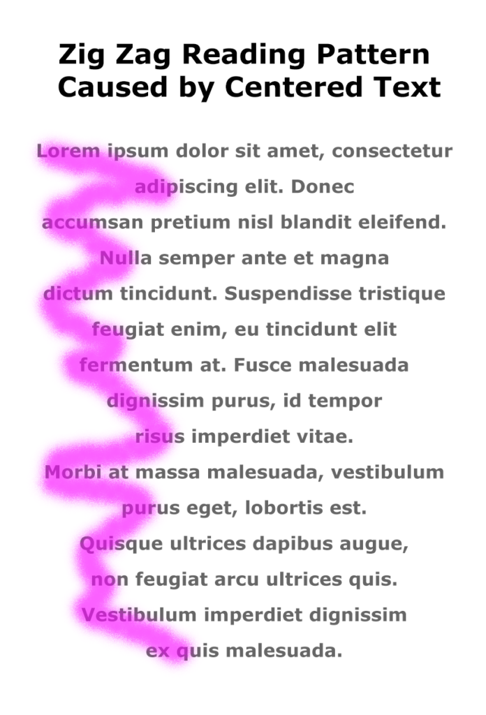
Zig Zag Reading Pattern Caused by Centered TextToday’s #TuesdayTutorial focuses on the alignment of the text in your document. Remember the #FridayFact earlier this month that explained the F-shaped reading pattern? That idea comes into play with the tip to avoid centered text alignment in your documents.

When you center text, the left margin zig zags back and forth down the page, which makes it hard to read in the F-shaped pattern that people prefer.

Instead of skimming down the left margin to look for the highlights and headings, the eye has to search back and forth for the information on the page, as shown in the image on the right.

Learn More

Watch the following Lynda.com tutorial video, Favor flush-left, ragged-right body text (4m14s), for additional explanations and tips on this important guideline for the way that text is aligned on a page. Remember that Lynda.com videos are free to Virginia Tech students with your VT.EDU login. Start at the VT.EDU login page to access these resources.
Note: This video has closed captioning, so it does not need a transcript.


#TuesdayTutorial: Improving A Table’s Appearance

#TuesdayTutorial: Improving A Table’s Appearance published on 21 Comments on #TuesdayTutorial: Improving A Table’s Appearance

Lynda.com Login Help

Lynda.com videos are free to Virginia Tech students with your VT.EDU login. Start at the VT.EDU login page to access these resources.

Document design matters in every project you will compose in the workplace. If you think back to the CRAP infographic, you know that your choices can influence a reader to examine your document fully or to skip it altogether. Bad document design often leads folks to declare, “tl;dr” (or “too long; didn’t read”).

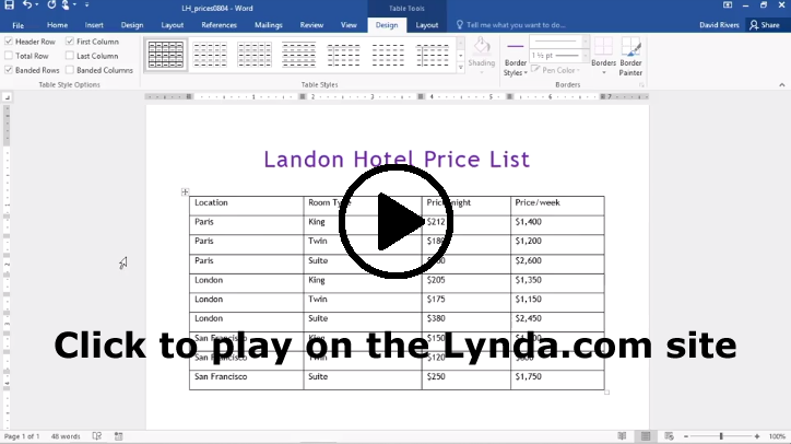
Most of the daily posts this week will suggest ways that you can improve your Analysis project by paying attention to the layout and formatting for your table. For our #TuesdayTutorial, I’m sharing some Lynda.com videos that demonstrate basic options for Formatting Table Appearance for Word 2016 and Word 365. If you have another version of Word, you should notice similar options in your version.

To learn even more about how to design your table, watch the entire chapter on Tables for either version or skip around and choose the sections you need:


Note: These video have transcripts, so they do not need transcripts.


#TuesdayTutorial: Using Parallel Structures

#TuesdayTutorial: Using Parallel Structures published on 19 Comments on #TuesdayTutorial: Using Parallel Structures

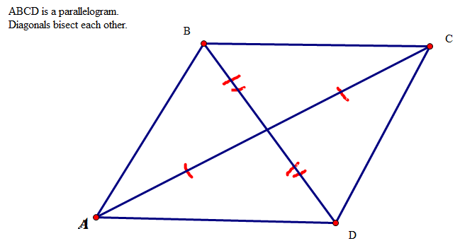
MRBCRGEO_Parallelogram_diagonal_example by michellebarnhill on Flickr, used under a CC-BY-SA 2.0 licenseThe columns of information in your Analysis project should use parallel grammatical structures. I’m sure that you all know what the word parallel means. You probably encountered it in a geometry course a long time ago. Remember the parallelogram?

You have probably seen the concept in courses here at Tech. Consider these examples:

  • A mechanical engineering major is likely to be aware of parallelism control and parallelism tolerance.
  • A building construction major knows that various parts of a building need to be parallel. (Imagine how annoying a staircase would be if the steps weren’t parallel.)
  • A computer science or computer engineering major knows all about parallel processing.
  • A finance major would be familiar with parallel portfolio optimization, parallel loans, and parallel markets.
  • A business major may know about organizational parallelism, including parallel leadership and parallel learning.

In all these examples, parallel generally means that two or more things match in some way. That is essentially what parallelism means in a writing course as well. When you are composing your Analysis table, choose parallel phrasing for the information in each column. For example, you might start everything in the purpose column with infinitive verbs (verb phrases that start with “to,” such as to explain or to provide).

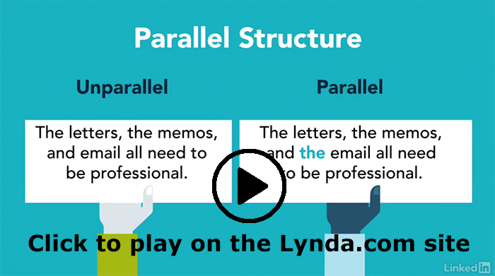
You can find out more about parallelism in the Lynda.com video on Parallel Structures (6m40s). The video begins with details on parallelism within a single sentence. At 4m50s into the video, the video discusses parallelism in bullet lists, outlines, and headings. That section of the video is closest to the kind of parallelism you will use for the columns of your Analysis table.

Lynda.com Login Help

Lynda.com videos are free to Virginia Tech students with your VT.EDU login. Start at the VT.EDU login page to access these resources.

Screenshot of the Parallel Structure video


Note: This video has closed captioning, so it does not need a transcript.


Image credit: MRBCRGEO_Parallelogram_diagonal_example by michellebarnhill on Flickr, used under a CC-BY-SA 2.0 license.


#TuesdayTutorial: Managing Your Online Reputation

#TuesdayTutorial: Managing Your Online Reputation published on 30 Comments on #TuesdayTutorial: Managing Your Online Reputation

As you work on your professional bios this week, you should also think about your online presence. Everything you put online has the potential to influence potential employers and colleagues. You probably already know that you should google your name to make sure there are no unfortunate messages found.

Today’s tutorial is included in the infographic (below) from a Swiss digital reputation management and security company. A related article, Protecting Your Online Reputation: 4 Things You Need to Know, is available from Mashable.

Steps 1 and 2 in the infographic explain why managing your online identity is important, and Steps 3 and 4 outline what you should do to ensure your online reputation helps you (rather than hurts you).

In addition to commenting on the ideas in the infographic, you can try some of the suggestions to find out what your online reputation is like and decide if you need to make changes. You can tell us what you find in the comments, if you like.


Note: This infographic has a transcript.


#TuesdayTutorial: Taking a Professional Photo

#TuesdayTutorial: Taking a Professional Photo published on 37 Comments on #TuesdayTutorial: Taking a Professional Photo
Bathroom mirror selfie. Self Portrait in Barbados by Jens karlsson on Flickr, used under a CC-BY license

Don’t Use This Bathroom Mirror Selfie

Professional Photo with clean, gray background. Me for Lindberg glasses by Jens karlsson on Flickr, used under a CC-BY license

Use This Professional Photo Instead

The Professional Bio Statement that you are working on for your first major project needs a professional photo that shows readers both what you look like and something about your personality and style. I know that none of you would use a bathroom mirror selfie, but based on what students have submitted in the past, I want to provide some specific guidelines.

What to Wear

  • Wear the kind of clothes that you would wear to work or to an interview. Be professional.
  • If you are pursuing a military career or currently in the Corps, a photo in your uniform works for this assignment.
  • Don’t use a photo in which you are wearing formalwear. Ring Dance or Wedding photos of you in a tux or formal dress are not appropriate. Your readers will know you are trying to make-do with a photo that was clearly for another purpose.

Choose Your Setting

  • Take your photo in a neutral location or in the kind of workplace where you hope to be employed. For instance, a photo on a construction site would be fine if you’re a building construction major.
  • Alternately, take your photo in a location that relates to your career. If you are a planning to be a veterinarian, you can take a photo with your horse in the stable or outside with your dog.

Eliminate Distractions

  • Be sure there is nothing unusual in the background of your photo. Check for anything that is out of place. You want your readers to focus on you, not the background.
  • Ensure that the photo focuses on you. Your significant other and friends do not belong in the photo. Crop out anything that doesn’t belong.

Read More

You will find a lot more useful tips in the step-by-step tutorial in the Hubspot post How to Take Your Own Professional Headshot: A Bookmarkable Guide, which says it takes 15 minutes to read. The article covers everything from how to set up your camera to editing your final choice.

Take advantage of feedback from your writing group as well. If you can’t decide which photo is best, ask them to help you decide.


Photo credits: Self Portrait in Barbados by Jens karlsson on Flickr, used under a CC-BY license, and Me for Lindberg glasses by Jens karlsson on Flickr, used under a CC-BY license.


Primary Sidebar