Lynda.com Login Help
Lynda.com videos are free to Virginia Tech students with your VT.EDU login. Start at the VT.EDU login page to access these resources.
On Thursday, our #InfographicInspiration explained background information on Gantt Charts, identified their basic characteristics, and outlined their strengths. As you probably recall, Gantt charts are one of the ways that you can organize the schedule in your proposal to make the details clear and easy to follow.
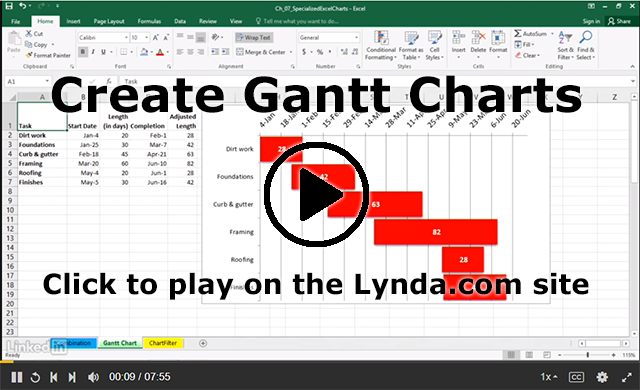
Today’s #WeekendWatch is a Lynda.com video that explains, step-by-step, how to use Excel 2016 to Create Gantt charts (7m55s). Videos are also available for these versions of Excel:
After watching the video, you can check out the contents for Excel 2016: Charts in Depth, the course that the Gantt Charts video is part of. It includes details on several other kinds of charts and more advanced information on using Excel to create charts.
If you are curious about Gantt charts, you can also watch the Lynda.com video Learning Gantt Charts (1h17m).
Note: This video has closed captioning, so it does not need a transcript.
9 Comments
This video was very useful I thought. My past experience with Gantt Charts involved changing the fill color in cells in a spreadsheet manually, and this method seems to be an improvement. It is a bit convoluted getting the chart running (which hopefully spreadsheet makers will improve in the future like the video mentions at the end), but once you do the initial steps to set up the chart, this method is a vast improvement on manually changing the color of a cell.
I found this Lynda video super helpful at being able to understand Gantt charts. From my prior experience creating Gantt charts in other classes, we had to hand draw them. However, for this class we are able to create them electronically, so this video well help me create a Gantt chart if I choose to make one for the next assignment. The most important thing that I learned from this video is that in order to get an option to create a Gantt chart, you have to change the dates to be formatted as general and then after you create the chart, you can change back the format to a date.
It’s interesting that you’ve always had to hand draw them–I’ve had the opposite experience. I always have to do them online, so these videos were a nice refresher. But I think doing them by hand would be better for me–it’ll make me more likely to follow through with it if it’s not on a computer–so I might try it!
This has easily been my favorite Lynda video so far. I can’t tell you how many times I’ve needed to make a graph or chart in Excel and flustered with all of the wacky controls and segregated menus. Once, I tried making a stacked box plot graph to accurately portray distributions of our software’s performance across different numbers of machines to our company’s client. Excel can’t even do box plots, let alone a graph of them. I struggled with making what I needed, and ultimately came up with something decent, but I actually did learn a lot of new things about Excel from this video. I wish I had known them a year ago. Like Matt said, I hope developers working on Excel realize the lack of necessary graph templates they’ve been missing for years.
I have never used Gantt charts, so I thought this video was very helpful because it gave a brief, yet thorough. I liked that it went through each step of how to change the excel document to match what you need. The most interesting part was seeing how it doesn’t take much time to make a very rough looking chart to look refined by simple excel functions. The Gantt chart is definitely something that’s useful in every day life, and people could use it as a planner because it says what tasks you have and how long they will take. For someone like me who is visual I think it’s something worthwhile to try.
I found this video to be very informative. I think gantt charts are a great idea for something like a project proposal, but I wasn’t too sure of the easiest way to make one before watching this video. Having this video is something that I find especially useful become I’m not very good with Microsoft Excel, and the video showed a lot of things I wasn’t aware of. For instance, I had no idea that each date is assigned a specific number in Excel, or that excel has a function that account for weekends in calculating a date.
This video is provides significant and educative information. I have been introduced to Gantt Chart in one of my previous classes but we always did it on paper. I have tried using excel for it but has not been successful. I like how he explained how to to take the blue bars off in order to arrive at the actual needed chart.
I found this video quite helpful. I have very little experience with creating Gantt Charts and with a timetable or scheduling being part of our short proposal, this video was very helpful. I love that the daily discussion posts almost always aid us in our current works. Not only do we gain knowledge for the future, but for our current works.
Like Josh, this is easily my favorite Lynda.com video so far. The tutorial on how to create Gantt Charts is wonderful. I’ve always done it by hand on paper, and never figured out how to create it in excel. The video will easily help make anyone better at time management and planning.