Infographic Transcript
Transcript by Thomas Conroy
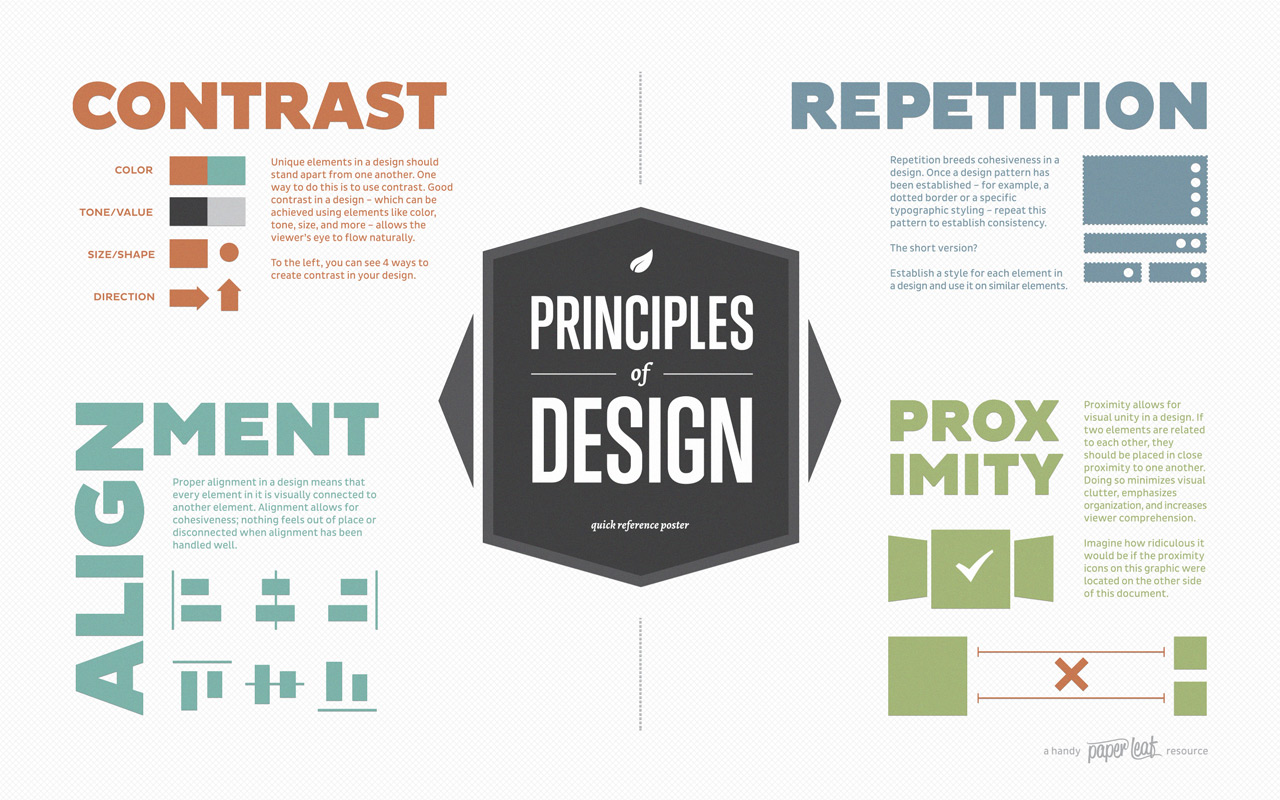
CONTRAST
Unique elements in a design should stand apart from one another. One way to do this is to use contrast. Good contrast in a design—which can be achieved using elements like color, tone, size, and more—allows the viewer’s eye to flow naturally.
The image shows 4 ways to create contrast in your design:
- Color
- Tone / Value
- Size / Shape
- Direction
REPETITION
Repetition breeds cohesiveness in a design. Once a design pattern has been established – for example, a dotted border or a specific typographic styling – repeat this pattern to establish consistency.
The short version? Establish a style for each element in a design and use it on similar elements.
ALIGNMENT
Proper alignment in a design means that every element in it is visually connected to another element. Alignment allows for cohesiveness; nothing feels out of place or disconnected when alignment has been handled well.
PROXIMITY
Proximity allows for visual unity in a design. If two elements are related to each other, they should be placed in close proximity to one another. Doing so minimizes visual clutter, emphasizes organization, and increases viewer comprehension.
The image states, “Imagine how ridiculous it would be if the proximity icons on this graphic were located at the topic of this document,” and shows related icons on separate sides of a column of text (so they no longer use proximity for visual unity).
Infographic source: a handy paper leaf resource
2 Comments
This infographic does a really good job of putting into words exactly what my eyes look for in a document or poster. I think alignment is especially important even though it’s probably the most likely of these to not be followed. I’m definitely the kind of person who says, “Oh, this looks close enough,” but the time and effort that goes into alignment is very important.
In one of my co-ops, we had to do a poster session about our work for the semester. When I was creating my poster, I found that everything just looked kind of off. I shared it with a fellow co-op, and upon moving everything pertaining to one topic and fixing the alignment, it was leagues more visually appealing. Just moving a couple of text boxes a few inches made a world of difference, just like the infographic said it would.
Slightly unrelated, but Lynda. com is a fabulous learning tool. I’ve used in my co-ops to learn many different kinds of software and statistic methods
I agree, this infographic provides a great understanding of how to format/design papers and posters. Personally, I think contrast is extremely important. While I was at IBM, I had to go over user-experience guidelines to ensure that it allowed for ADA use. Contrast is extremely important for those with limited sight; it assists with differentiating items on a website or window. Repetition was also important because so that the user always feels like their using an IBM product. Most products offered, use similar or the same styling. Many companies do this so that their brand becomes ingrained in the user.