Lynda.com Login Help
Lynda.com videos are free to Virginia Tech students with your VT.EDU login. Start at the VT.EDU login page to access these resources.
Document design matters in every project you will compose in the workplace. If you think back to the CRAP infographic, you know that your choices can influence a reader to examine your document fully or to skip it altogether. Bad document design often leads folks to declare, “tl;dr” (or “too long; didn’t read”).
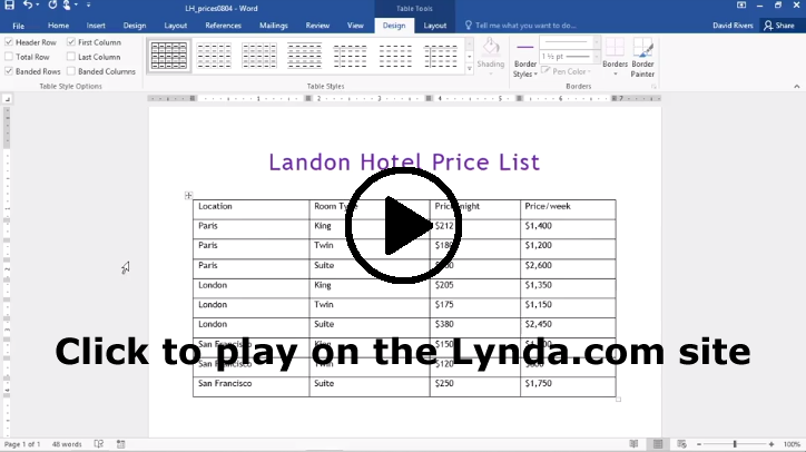
Most of the daily posts this week will suggest ways that you can improve your Analysis project by paying attention to the layout and formatting for your table. For our #TuesdayTutorial, I’m sharing some Lynda.com videos that demonstrate basic options for Formatting Table Appearance for Word 2016 and Word 365. If you have another version of Word, you should notice similar options in your version.
To learn even more about how to design your table, watch the entire chapter on Tables for either version or skip around and choose the sections you need:
- Chapter 8: Working with Columns and Tables in Word 2016
- Chapter 8: Working with Columns and Tables in Word 365
Note: These video have transcripts, so they do not need transcripts.
