Lynda.com Login Help
Lynda.com videos are free to Virginia Tech students with your VT.EDU login. Start at the VT.EDU login page to access these resources.
Our #WeekendWatch shares one more way that you can improve your table for the Analysis project: Spend some time making your table accessible to people who use magnification or screen readers.
Here’s an example of why accessibility matters in a table. If a table is not set up properly, the screen reader will read the information as if the columns follow one another like sentences in a paragraph. The reader moves through the document from left to right and top to bottom. To make a table more accessible, you need to identify table headers. Once you do, the screen reader will read the column header and then the content of the cell.
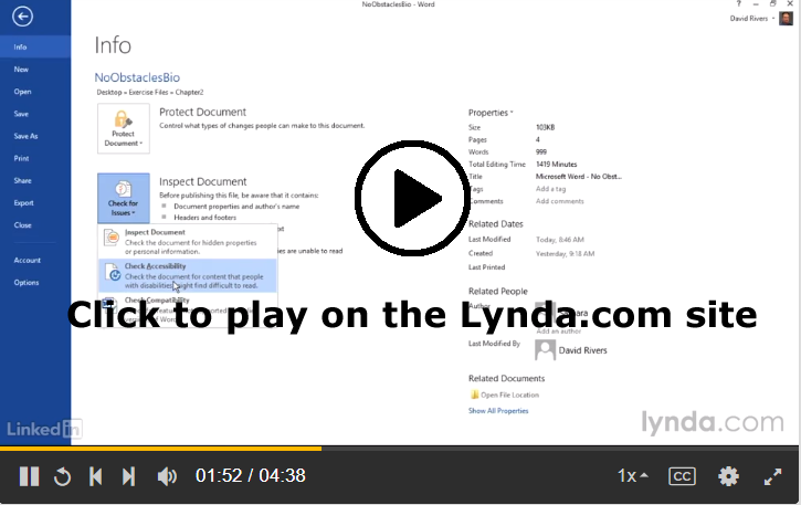
The Lynda.com video below demonstrates how the process of Using the Accessibility Checker, which is built into Microsoft Word. The simple tool will suggest ways that you can change your document to make it more accessible.
You can learn more about accessibility in Word by watching all of Chapter 2: Creating Accessible Word Documents on Lynda.com. In addition to the Lynda.com videos, you can find more information in the resources linked below:
- Make your Word documents accessible, from Microsoft.
- Video: Find and fix accessibility issues in Word 2016, from Microsoft.
- Microsoft Word: Creating Accessible Documents, from WebAIM: Web Accessibility In Mind.
Note: This video has closed captioning, so it does not need a transcript.

7 Comments
I never knew that Word had an accessibility checker. I have used Microsoft Word for years, yet I never knew this was an option. I found this video very informative about how the accessibility checker works. It is helpful because this checker will give you some tips, errors, or some issues. This can really come in handy when you have a super long report for some class that you need to check over for any issues. From the Lynda video about making text more accessible, I learned how to modify a style of text from a window that will pop up. These video will be really helpful with the table we are all creating and also future reports for this class or other classes.
Same. I’ve used Word’s backwards compatibility features to go between .doc and .docx, but I haven’t ever paid attention to accessibility. It makes sense though; accessibility features tend to destroy stylizations, so there’s different things that will better tag and mark page elements to prevent that from happening. I do appreciate that Word has an automated tool for identifying those things without imposing changes by itself.
I noticed that they pointed out “errors” for accessibility, and one of these I think would be color blindness. One of the most common forms of color blindness can make table color schemes very hard to differentiate (I think it’s reds and greens that are indistinguishable). I think it’s amazing that Word would point something like that out to you.
I agree with Danielle and Josh because I’ve never seen the Accessibility Checker for Microsoft Word. I think that it allows the writer a chance to edit their own work before people peer review it. There are also things that you don’t even consider that make the paper better such as not having image watermarks and using hyperlinks instead of a long link that takes up too much space. The nice thing too is that as the writer you don’t even need to pay that much attention to it because of the Accessibility Checker which can do all of that for the writers. With so many advancements in technology I feel like Word will only continue to expand on being able to help writers improve not only the layout of the page, but the structure of sentences and give suggestions on better wording to use.
This video makes it seem like we are trying to advertise our writing to customers. Its focused on “accessibility,” convenience, appearance, etc. which are all targets of successful advertising. This goes back to our professional bio project when we are essentially trying to sell ourselves to our readers. Our writing is a reflection of ourselves and we want to appear accessible and organized.
I was a little confused about the purpose of this video though. Is it meant for documents that are opened on a computer to then be edited and clicked on to different links? Or is it just meant to make a document look better?
I’d argue that those are features of good persuasive writing (and much writing in general). No matter what you write, you still need to make it easy to use, clear, and accessible to all your readers.
The accessibility mentioned here targets people with different abilities than our own (as far as I understand it). Screen readers are generally used by those who may not have the ability to read the information themselves, whether it is due to differences in vision capabilities or something else. It is important to be considerate and aware of these differences, as your audience will greatly appreciate it. I have noticed throughout this course the effort put into to make it accessible to everyone and I truly appreciate and will strive to make my own work as accessible.
I think I’ve used the Word quite a lot so far, but I never knew that the Word has the accessibility checker. It’s definitely one that I would take a look at and refer to when I think I’m done with the analysis assignment. It will possibly help me improve the accessibility of my document.