How to Choose Colors That Work Well Together
Transcript by Zachary Chrystal
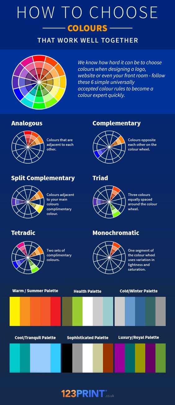
We know how hard it can be to choose colors when designing a logo, website, or even your front room – follow these six simple universally accepted color rules to become a color expert quickly.
Analogous
Colors that are adjacent to each other on the standard color wheel, such as red, orange, and yellow.
Complementary
Colors opposite each other on the color wheel. Examples would be orange and blue, or lime green and pink.
Split Complementary
Colors adjacent to your main color’s complementary color. On the standard color wheel, pick a main color and then use the colors next to your main color’s complement. An example would be purple as the main color with yellow and orange.
Triad
Three colors equally spaced around the color wheel. An example would be purple, red, and yellow.
Tetradic
Two sets of complementary colors. An example would be blue and orange with pink and lime green.
Monochromatic
One segment of the color wheel uses variation in lightness and saturation. An example would be taking the color orange and using variations of this color.
Different Color Palettes
These examples iInclude colors with variation in lightness and saturation.
- Warm / Summer Palette: Uses the colors yellow, orange, and red.
- Health Palette: Uses the colors green, white, and grey.
- Cold / Winter Palette: Uses the colors grey and blue.
- Cool / Tranquil Palette: Uses the colors teal and light blue.
- Sophisticated Palette: Uses the colors black, grey, white, tan, and brick red.
- Luxury / Royal Palette: Uses the colors purple, teal, light green, dark purple, and dark green.
Note: Spellings in this transcript have been Americanized.