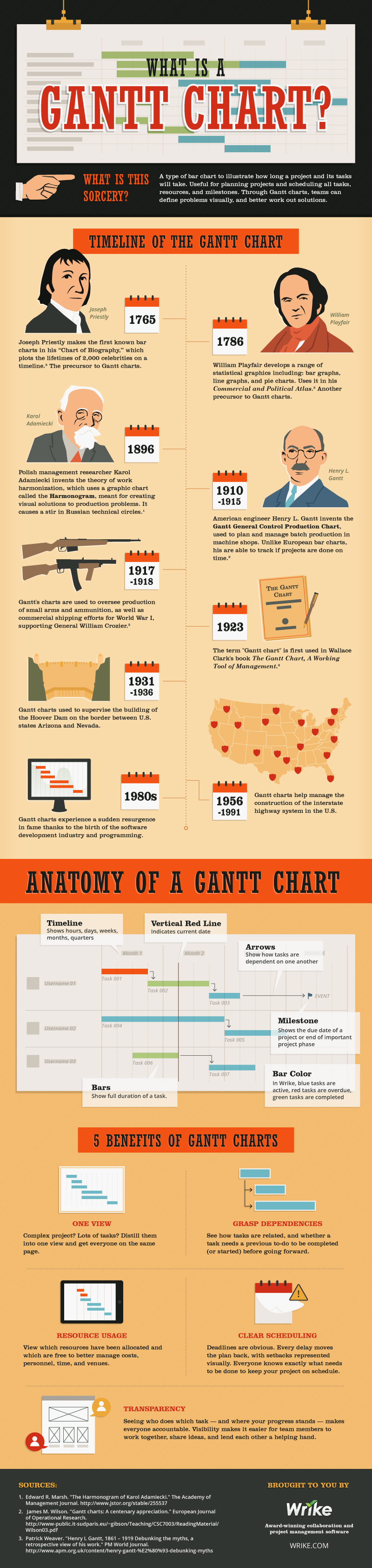
What Is a Gantt Chart?
What is this sorcery?
A type of bar chart to illustrate how long a project and its tasks will take. Useful for planning projects and scheduling all tasks, resources, and milestones. Through Gantt charts, teams can define problems visually, and better work out solutions.
Timeline of the Gantt Chart
Joseph Priestly – 1765: Joseph Priestly makes the first known bar charts in his “Chart of Biography,” which plots the lifetimes of 2,000 celebrities on a timeline.(3) The precursor to Gantt charts.
William Playfair – 1786: William Playfair develops a range of statistical graphics including: bar graphs, line graphs, and pie charts. Uses it in his Commercial and Political Atlas.(3) Another precursor to Gantt charts.
Karol Adamiecki – 1896: Polish management researcher Karol Adamiecki invents the theory of work harmonization, which uses a graphic chart called the Harmonogram, meant for creating visual solutions to production problems. It causes a stir in Russian technical circles.(1)
Henry L. Gantt – 1910-1915: American engineer Henry L. Gantt invents the Gantt General Control Production Chart, used to plan and manage batch production in machine shops. Unlike European bar charts, his are able to track if projects are done on time.(2)
1917-1918: Gantt’s charts are used to oversee production of small arms and ammunition, as well as commercial shipping efforts for World War I, supporting General William Crozier.(3)
1923: The term “Gantt chart” is first used in Wallace Clark’s book The Gantt Chart, A Working Tool of Management.(3)
1931-1936: Gant charts used to supervise the building of the Hoover Dam on the border between U.S. states Arizona and Nevada.
1956-1991: Gantt charts help manage the construction of the interstate highway system in the U.S.
1980s: Gant charts experience a sudden resurgence in fame thanks to the birth of the software development industry and programming.
Anatomy of a Gantt Chart
Timeline: Shows hours, days, weeks, months, quarters
Vertical Red Line: Indicates current date
Arrows: Show how tasks are dependent on one another
Milestone: Shows the due date of a project or end of important project phase
Bar Color: In Wrike, blue tasks are active, red tasks are overdue, green tasks are completed
Bars: Show full duration of a task
5 Benefits of Gantt Charts
One View: Complex project? Lots of tasks? Distill them into one view and get everyone on the same page.
Grasp Dependencies: See how tasks are related, and whether a task needs a previous to-do to be completed (or started) before going forward.
Resource Usage: View which resources have been allocated and which are free to better manage costs, personnel, time, and venues.
Clear Scheduling: Deadlines are obvious. Every delay moves the plan back, with setbacks represented visually. Everyone knows exactly what needs to be done to keep your project on schedule.
Transparency: Seeing who does which task – and where your progress stands – makes everyone accountable. Visibility makes it easier for team members to work together, share ideas, and lend each other a helping hand.
Sources:
1. Edward R. Marsh. “The Harmonogram of Karol Adamiecki.” The Academy of Management Journal. http://www.jstor.org/stable/255537
2. James M. Wilson. “Gantt charts: A centenary appreciation.” European Journal of Operational Research. http://www-public.it-sudparis.edu/~gibson/Teaching/CSC7003/ReadingMaterial/Wilson03.pdf
3. Patrick Weaver. “Henry L Gantt, 1861 – 1919 Debunking the myths, a retrospective view of his work.” PM World Journal. http://www.apm.org.uk/content/henry-gantt-%E2%80%93-debunking-myths
Brought to You by Wrike
Award-winning collaboration and project management software WRIKE.COM